
Today's the day for the new Xbox dashboard! Microsoft has confirmed that a brand-new version of the Home UI is rolling out from today for all Xbox One, Xbox Series X and Xbox Series S consoles.
The Xbox team has highlighted seven benefits of the new UI over on Xbox Wire, which are as follows:
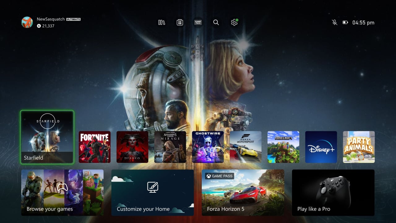
- Makes it easy to go to your Library, the Microsoft Store, Xbox Game Pass, Search, and Settings at the very top of your Home by introducing a quick access menu.
- Creates more space for your personalized background by simplifying the layout and putting the games you recently played and other content and apps towards the bottom of the screen.
- Adds an option to change your background to match the game you are highlighting in the recently played list.
- Improves game discovery by introducing lists of games curated and personalized for you.
- Allows you to customize your experience by pinning your favorite games, curated groups, and system groups like Quick Resume to Home.
- Helps you find what’s going on in your community through the updated Friends & Community Updates row.
- Shows you what media apps and content are available to you via a Watch & Listen spotlight and list of entertainment apps
You can see examples of these features in the video shared by The Verge's Tom Warren up above, and he's also provided this quick look at how the game art changes in the background based on which game tile you've highlighted:
Team Xbox says that the journey to improve the Xbox dashboard has been a huge effort, and there have been multiple changes made to the design over the past eight months since it first began its testing phase for Xbox Insiders.
"When we first showed Xbox Insiders what we were working on we heard your feedback clearly – you wanted more room to show off custom backgrounds or game art, quicker navigation options, and more personalization.
Over the last 8 months since initial release, we’ve implemented changes to meet those requests and have a new Home that feels fresh, puts the focus on your games and apps, and creates space for beautiful backgrounds."
It's finally now time for the new Home UI to begin its public rollout to all Xbox One, Xbox Series X and Xbox Series S consoles, although keep in mind that the rollout takes place in multiple stages, so while some Xbox owners will get access to the dashboard immediately, others may need to wait up to a few weeks before it arrives.
In any case, you can guarantee you'll be seeing this new design on your Xbox console soon!
What are your thoughts on the new Xbox dashboard design? Tell us down in the comments.
Comments 95
Good news everyone! It is finally here! Now, instead of having boxes all over your still-life picture you all get to look at the top half of the picture! And say bye-bye-bye to those pesky cards you used to have on your dashboard! Those have been replaced by our Recommendations! Now all of the movies you didn't think you wanted will be displayed in nice lines that take up a third of the screen!
Don't ever want Gamepass? We here at Microsoft don't believe you! So much so we will inundate you with line after line after line of all the titles you don't know you don't want!
That's not all! The customization you used to have? That's split by our handy recommendations too! We know you need this valuable information BEFORE you get to your purchased material- so we placed it at the very top of the UI. Where we know you wanted it!
You are welcome valued customer!
About time. My girlfriend has had the new dash on her Series X for months now.
Now I can finally enjoy it too instead of looking at her screen and being jealous. 😂
Though I would like the option to disable it replacing the background with game art.
Been using this for about a month and love it. Great to finally see our backgrounds more prominently. And it’s easy to find things like new GamePass additions. Nice to hear it’s finally getting an official rollout to everyone!
@awp69 oke , nice 👍
"Rolling out to all Xbox consoles today" ... looking at my Xbox 360 and realizing it doesn't exist anymore : (
Had this for a few weeks now, and it's generally fine, but it's a real shame you can only pin two groups at a time. Gotta keep space free for all those adverts!
Ah crap. I haven’t turned mine on in over six months. Gonna have a ton of updates to run. Sigh.
Keep in mind it's from today, so not everyone will get it immediately - some may be waiting a few weeks.
How is there MORE personalization!?
Now I can only have 2 groups on home, can't move them around, can't move games around, and now home is cluttered with a bunch of random stuff that I can't move or remove.
This is trash. This should not have been approved by anyone.
I'm wondering what version of Fortnite that is? The icon represents the current season, and that's not the current Xbox icon. Perhaps a preview build of next month's season???
@Kaloudz Didn't everyone want less ads? Wasn't that the whole thing?
Now it's 99% ads.
@FraserG I read some people saying there is now a low limit on the number of custom groups you can have on the Home Screen, is this true?
Sounds and looks lovely.
I really like it. Looks nice and the background is actually visable now! I know others don't like having the extra stuff and ads that we can't remove, but it really doesn't bother me, and will probably help me find more games to play.
@PhileasFragg
That person is also “playing” AC: MIRAGE , FORZA MOTORSPORT and STARFIELD.
So yeah , probably someone that has access to preview builds.
Removed - inappropriate; user is banned
@Fishticon as much as i do like the homepage itself. The underneath add’s and Gamepass this and top played games that and apps etc etc etc is just awful and a waste of system resource’s. No wonder we don’t have HDR on the Ui it would have to use to much resources to power all the filler junk. I give the home screen a solid 8/10 but not being able to remove all that filler below is a huge 1/10 for me. I agree with your post and thanks for having the courage to call it out. This update ended up disappointing me. For the record not saying you’d care but i hate the card system on the PS5 also. It’s bloated and they rarely even work. Ui’s should be simple and clean and HDR 4K.
it wrecked my home screen, dumbed me down to two of my groups, splits them apart between gamepass/game recommendation ads and effectively turned my home screen into another PS5 UI.
nope....nope don't like it. i hate it. my layout is just gone. i'm having to go into my games, overlay or not, just to see my own shortcuts without bloat.
This update is yet another testament to why i use Mac and Apple products for the last 19 years of my life. Clean simple UI’s and more intuitive to use. MS windows and now Xbox are just far too bloated and not good on the eyes to use. I was really excited to get the new home screen and it’s nice if it wasn’t cluttered and have 400 useless things for me underneath it vs what i would want there. Same for Android, the phone comes with 3 places your photos go. I don’t need or want that. I’m ranting and i will get pushback from one or several of you but i am just tired of wanting to like my Xbox for what i want it to be vs what MS pushes out.
I'm a UI / UX designer this is mid - I created something like this and it didn't work out in prototyping. The user still had to press the same amount of buttons.
However the UI part is alot better than previous versions. I actually love the PS5 UI. Simple, clean and as a UI / UX designer it passes for me.
@Lightweight i like the PS5 Ui minus the card system they use. It’s cluttered and they rarely work correctly. If they ditch the card system on PS5 and moved the Game library to the left and fixed it some it would be a solid 9/10 for me. However i can’t use the dual sense for most games. It’s just not a comfy layout for me.
I've had the new dashboard for a while now courtesy of being an Xbox Insider. Not sure how I feel about it at the moment, other than it's different.
I still haven't got the update yet
Im not a fan of how it is, so I'll welcome a change, even if Im concerned at the amount of 'filler'.
I absolutely hate this thing. It barely shows the picture still and instead of cleaner UI it looks like my gotdamed Samsung S95B (don't buy it ever) which is pushing me 100 ads every time I turn the thing on. I'm really questioning my recent purchase of this machine. Everything after the showcase has been bad.
This has not hit my Xbox yet and I don’t think it will for maybe a week or more which is a bummer.
This is a much better Home Screen in my opinion. Now if I could just lock things to the bar with all the tiles.
PlayStation has had the game art in background for years, also it plays it's theme music along with the art.
The xbox home menu would look much better without the 4 big tiles under the little game tiles.
I love the way he says, "one of my favorite features of the new Xbox Home UI is the way the game art changes in the background " - considering the fact that the PS5 has had this feature since day 1. It's kool. I like it, but he should have said something about xbox LITERALLY STEALING a page out of sony's playbook with this feature.
Not a fan of this update at all. Tons of clutter which can't be removed. If we could customize and get rid of the intrusive ads etc then it would be OK. Sadly that's probably not going to happen.
@KoldFire well they both use each others idea’s so much, there is no reason to really do that. Sony does a lot of what MS does after the fact and vice versus. I have both a Series X and PS5 and think the UI’s are vastly different.
Didn't have it this morning, went out, ran a few errands came back couple hours later and the new dash was there. 2 minds atm, it is cleaner but the tiles are smaller and my eyesight isn't great
No update here. Oh well.
@HonestHick I also have both a Xbox Series X and a PS5, I'm not on either team. I'm a fan of games. Period, regardless of system. However it does seem a bit negligent to not even mention that the UI is sort of a blatant ripoff of Sony's.
@KoldFire i agree with you, i am just here for the games. Both consoles need some Ui love. Sadly i thought this one would let me remove all the filler junk i don’t need or want to see.
About time...It's been on my One X for over a month. Looks good. Icons far lower button could be better. The background is doesn't look like Kilroy peeking over the top so much anymore.
Now they need to fix the wishlist bug.
Xbox should add control over the UI, allowing you hide the icons. A "sleep timer" and a button control. Pull left trigger to hide the UI when at the top level. Pull again to show the UI. Hit any button to wake the "sleeping" UI.
@KoldFire Pretty sure the game art used to show full screen when you highlighted the game that was in your disc drive way back on the Xbox 360 NXE dashboard. Therefore, it's not a new thing that they've literally just stolen from PlayStation. Hell, if an idea is a good one anyway, why not implement it, just as Sony did when they launched PSN which many would argue was copying Xbox Live. 🤷🏻♂️
It ain't great, that's all I'll say. Changing backgrounds (when supported) is a neat feature lifted from PS5; but ads, just 2 groups, and somehow cards done poorly (this is MS, they literally made that design language famous once upon a time).. I'm using a 55 inch 4K TV at less than 3m distance and can't make out card content clearly. WTF?
After receiving the new dashboard and checking it out, this is definitely the worst the dashboard has ever been. You can tell that the sole purpose of the redesign is to try and force people to sign up for Game Pass.
@InfamousOrange
Sign up for the xbox insider free public Delta ring and you can get it immediately now
@Grumblevolcano
Haha, yeah but in Australia they have to give you a Full Refund if you unsubscribe from Game Pass, so I use Game Pass all the time FOR FREE LOL to try games I might like to buy, e.g. Atomic Heart, which I disliked and so didn't buy.
@Darylb88
Sign up for the xbox insider free public Delta ring and you can get it immediately now
new X Box One S dashboard sucks.
Older one from last year was better in my opinion since old dashboard was easy to navigate
I’m happy with how this looks. So much better than the Dashboard we had before. Just wonder how long until I get to have it because I’m still on Xbox One so doubt that would be a priority to update first.
@themightyant @Fishticon yeah only 2 groups can be pinned to the home screen now and they can’t be moved it’s awful.
This new dashboard has now taken away user customisation and replaced it with a home page full of ads and useless crap!
It’s a total sellout and the fact that we can now only pin 2 groups to the homepage sucks balls!
I hate it and the posts stating how amazing it is are all delusional!
Removed - trolling/baiting; user is banned
@Tagboomer I sincerely cannot believe anyone likes this. If anyone likes this they have no taste what-so-ever. It is objectively bad.
@Cashews I know right it’s a massive backwards step for gamers! We don’t want to see a page full of preloaded ads for crap that we have no interest in! I’m sick of these companies trying to say they are being innovative but the truth is they are selling out!
@Tagboomer Listen. Activision has backed off of some of their more questionable choices. We need to start a campaign on this atrocity. No joke, this one is off the charts bad.
Start hitting them with mail night and day. Use all of the socials if so inclined. MS shouldn't be allowed to use our machines and bandwidth to sell us their bs.
https://support.xbox.com/en-US/
Quick access features at the top good. Something GT7 could learn from when GT1&2 or GT5 had them. XD Yes I know games versus OS UI but still it annoys me. I like quick access menu features the same as any quality of life mechanics or menu elements.
Otherwise that's about it other than oh more things visible in the middle row of previous things accessed which is nice. It's still whatever is previously the one thing I never use in Windows or Office 'ever' and remove the history because of how annoying the feature is but it cuts off visibility past a point so it's fine on console.
Other than that I don't like it. I haven't liked it since the 2nd, or 3rd or 4th existed and hated those too I just don't find it easy to navigate at all and the look is just not for me I don't like this modern design.
I could take Windows 8/8.1/last 360/Windows phone 8 look of flat and still no issues navigating them but Windows 10/Xbox One 2nd UI onwards I've been consistently lost and hate the look.
So while I hate flat design I'm willing to say I liked some flat design but not others. Windows 11 limiting options for quality of life to 'simplify' makes me not want to use the OS that's how much I can't stand it let alone the MS telemetry 10/11 have or the awkwardness in other areas. I'm good with Linux after 2025.
Also they haven't changed the settings menu which also still confuses me. They change the front but not the back it's annoying I have problems with both so leaving the settings the same way since the 3rd UI doesn't help me Microsoft you can't change the front look and think it's solved.
There is a reason I liked Blades and the last 360 one and the first Xbox One UI and that's it. PS4 I like the up and down like XMB but it's just enough to get to things, settings work, I love the folders. PS5/Series/Switch all have groups and I hate it. I use them on Xbox One to 'view the games thumbnails for my library' otherwise I never use it for anything else just 'looking', not launching apps/games. I have yet to even get 12 games to even do it on Switch yet. XD
Or LiveArea on Vita (ah the 10 in folders works great, a bit awkward to do on PS TV then handheld with touch but still good) or XMB on PSX, PSP and PS3 (can be a lot of settings but still easy to work with), Wii, PS2, GameCube and OG Xbox in their own ways.
Personality (not flat and boring/streaming service like either). DS/DSi was fine.
Wii U/3DS are fair but can be a bit confusing sometimes but still more personality to them.
Switch/Xbox One+ just disappoint me in personality and in some parts navigating around particular features. I don't like the PS5 UI at all.
The fact I made my Xbox One X slow down by putting disks in and out of it, adding games to my library with the groups feature for 2 hours and it struggled says a lot. I doubt the Series consoles do that but regardless I hadn't booted up a single game other than for the sake of the group tagging, so I paused installs/launching the games only to add to the groups of 360 BC and Xbox One, that was a year or so ago.
Obviously the console works fine I've used it many times since but it just surprised me I hadn't played anything that day of 2hr marking and it only slowed down from menu hopping for 2 hours. It's really sad. I think I have it on default too I hadn't edited the internet hogging Gamepass, ads, achievements and other info below it (got sick of doing it and left it/wanting to see the default).
I may change that on my Xbox One VCR if I ever need to use it for Kinect Sports or space on there for games I care less to use regularly and want it to be as free of internet seeking stuff and out of visibility as possible.
I did that on my One X for backwards compatibility and Xbox One groups to create so I didn't have to look at what was on my shelf or at the Xbox website for back compat to see if my games were compatible or not.
@Cashews totally agree its now full of recommendations if the 3 ads wernt annoying enough its now spewed all over the place
the people who think this is better clearly havent scrolled down and seen what an abject disaster it is
@SuntannedDuck2 the Switch UI, with zero personality, is miles and miles and gd MILES better than this junk. For the simple fact it is ultra clean and IT IS YOURS.
This is a bag of rotten, hot garbage - left in the trunk of a 1977 rusted Pinto with one sun bleached purple door - over the entire summer in a Texas abandoned mall parking lot.
You open the bag of maggot infested trash and this is what you find.
@Zochmenos yeah I should be more collected and happy when a company takes over my bandwidth to force feed me their ads and take over the machine in which I paid. Because everyone needs the xbox so much that they have about 7% of the games market. We need them and not the other way around.
My bad.
@Zochmenos nothing else gets the attention of large companies except theater. At any rate, g'night. I'd be happy if I wake up to a MS mea culpa and a rollback to the less awful but still awful UI , but I know I won't.
I'm not at all happy with this dashboard, it reminds me of a "personalized news feed" on a phone browser.
It's ugly, a pain to navigate, flooded with adds for games and movies I have absolutely zero intention of playing or watching, The fact I have to navigate to separate menu to access my Groups is inefficient and annoying.
I used to be able to quit out of a game, scroll down, and within 10-20 seconds, be booting up something else to play. That was my dashboard experience. I'd only ever spend longer on the dash if something I wanted to play was updating or downloading/installing.
TL;DR: the new dashboard is an inefficient mess, and they should keep the store and game pass separate from the dashboard instead of merging them.
Anyone know how you actually enable the option to show the game art of the currently selected title as the background art? I can't seem to find it anywhere.
Edit: Never mind. I had to force the new dashboard to default settings and it automatically started working.
Holly guacamole, the amount of vitriolic reactions are hilarious. I'm totally outraged, since I made a habit of starring at the console's UI rather than finding and playing games 🤦♂️😅😅....
Such mixed reactions - too bad there isn't (can't be?) an option in the settings to switch between the previous and latest version, at least.
(And options to switch off ads...)
I like the new dash and have done since the first day of preview, I don't care about the ads and to be honest they sometimes are helpful like what is out/ coming out on GP , and lets face it if they got rid of all the ads chances are they would make the money they get from ads from elsewhere like rasing gp sub prices
@Tagboomer that’s awful. Currently I have 4-5 pinned groups with things like Playlist, Gamepass AAA, Gamepass indies, etc.
Hopefully they sort that quickly, a quick google suggests plenty complained during alpha and I suspect even more will at launch.
One step forward, two steps back… or vice versa
@LoquaciousB Right but I think most people would agree that PS plus was in Response to Xbox Gold. However, I'm saying the fact that the guy from the verge didn't at least mention that this is actually a PS5 feature seems a bit negligent.
Think it looks ok. Not like i spend much time on any of the consoles UIs. All 3 are fine. Usually im spending most of my time actually playing games. The dashboard is really not that important. Talk about an over reaction by some of you lol its been pretty funny to read to be honest
@KoldFire Given that it's a feature that existed around 12 to 15 years ago on Xbox 360, I'm sorry but, your position doesn't make any sense. It seems you're simply annoyed as they didn't give Sony any credit in their article. To call it negligence is ridiculous. Both Sony and Microsoft "borrow" ideas from one another and it's nothing new. Heaven forbid someone doesn't mention in their article, about the new Xbox dashboard, that this limited and pretty inconsequential feature already exists on your precious PS5. 🤦🏻♂️
@Kaloudz I'm in agreement with you. I don't understand the furore over the "ads". I would only consider them problematic if they were advertising crap, like we get littered all over websites on our browsers. It's just content promotion as far as I'm concerned and if I'm not interested, I just ignore it.
I think the new dash is far quicker than the previous iteration, which was painfully slow at times. I'm happy with it.
I've had it for a while now and I like the main changes to the top of the dashboard, all those lines of game pass stuff they've added underneath are annoying. One of them does make it easier to see what has just come to Game Pass but I don't need all the others really.
Not got the update yet, but looking at this video, it seems very bloated with stuff I'm not interested in seeing
Wow, they really missed the boat in finally giving next gen owners something unique for their console.
I must say, people seem to be quite “passionate” about the UI here…
As someone that never personalized the old UI, it feels a bit strange to start with (recently released games on GP is way lower than I would prefer) but I like the option for background image in line with the game you're playing.
@LoquaciousB Clearly, I'm not the only person who has brought it up, on here or on twitter. Seems there are more people who share my opinion than not. Not sure sure what the snark is about but have a nice day.
@Kaloudz When it comes to ads my main issue with them is that there is a perfectly good store/marketplace that they can have all the ads they want on so there is no need for them to be on the dashboard itself.
@Cashews You summed everything right up. The entire dashboard is a Game Pass ad.
New dashboard layout is horrible.
I liked the older one from 2020 to 2022. Old dashboard layout for my X Box One S was easy to use
New layout sucks since they put the My Games and Apps button on the very top center of the screen. Why and what the hell for?
@Bartig don't forget the movies you can rent!!!
Getting sick of ads tbh, it ruined the web and now it's ruining my xbox.
I can tolerate it when something is free as companies are there to make money, but I paid for this console and I also have to pay a subscription to play online. Makes me want to throw it in the bin and go back to PC gaming.
My Series X still hasn’t updated to the new dashboard yet 🙄
What an utterly awful dashboard! Forcing you to see recommendations, updates etc you have NO interest in and cannot remove! What ***** is that! It’s awful absolutely awful. And I can’t find anyway to change it.
It is just a God awful AD INFESTED mess! Hate it, completely hate it. And the fact I cannot change it in anyway it disgusting. I do NOT pay a premium price plus a subscription fee to ‘mandatory’ ads shoved down my throat on my console!
I had about 5 lines before on my Home Screen I customised, I now have 20, 90% of which are ads or suggestions (ads) that I cannot get rid off. Great work Microsoft…🤦♂️
When the Xbox 360 came out it had the sliding tabs and was quite clean. Not perfect, but it worked well. They then updated the dashboard to the more current design, and everything was still great. Every dashboard after that point got more and more ads. Towards the end of the 360 lifecycle I counted the tiles on the dashboard and there were 30 something functional tiles, and over 110 ads. I was a huge 360 fan, but it was so maddening that I ended up skipping the Xbox one for several years to get away from ads being constantly pushed. Fast forward to the late 2010's and someone at Microsoft finally figured out that ads are pushing people away. The dashboard was almost entirely clean again, and Xbox became a more consumer focused platform than the competition (except for Nintendo...). Fast forward to today and here we are again. The ad focused anti consumer strategy has started again, and Microsoft won't figure out it's a bad thing until their user base is pushed away to the competition again.
My favorite part is how the recent apps no longer include settings allowing more games I frequently play to be right where I want them.
I don’t like the new dashboard - it has killed my pinned Groups, allowing only 2 maximum - & there is no way to delete or move the other pins..
So now there’s less customisation / personalisation with seeing your content. Since there’s no option / setting to change how the other pins are, MS/XB has removed choice from the user.
The only solution, other than leaving feedback with XBSupport (which I’ve done) is to go to the all games list to find games (this will be harder for people with larger libraries, & who took the time to make/arrange them into groups)
TLDR: Bring back customisation by allowing users to pin/delete whatever they choose. Thanks for reading, wishing you all the best
Its simpler and gives more view of your theme, of thats important.
I miss the old 360 slider.
@Kevw2006 to your point which is 100% correct. When you open the store many of the same ad’s are in there already. Like to the T the same. So why on the dashboard as well. Double dipping not a good look microsoft.
@iplaygamesnstuff that is for sure a highlight. I to really enjoy that. Personally the home screen is fairly great, it’s under the Home Screen that is just to ad and GP heavy.
It's not perfect but it's an improvement. I wish they would take the switch/steam deck approach and let us just keep scrolling to the right tho. The advertisements are pretty insulting with how much money most of us are paying, it cheapens the whole feel. Even amazon let's you pay $15 to remove the ads from a fire tablet ui, which is still garbage btw.
@iplaygamesnstuff
Yeah I like this too. The store also doesn't take up a space now in the recent apps. The only thing non-gaming related taking up space there now is the Rewards app and internet browser.
@Cashews The Switch one has no ads and garbage bogging it down. But no personality is not 'your' personal touch. You aren't moving things around, no background and such. So if you prefer it that's fine. I don't care to change much. I don't care for themes and customisation but I can see the appeal.
I mean the news I only read a few times. Not into screenshots (it has the buttons are on the controller and some moments are worth screen-shoting of course).
Not used the game clubs or whatever feature (like the PS5 following feature for games news and other stuff I assume a continuation of the PS4's videos/streams, pictures and so on activities).
They get the job done I guess like the Wii's did. Sure not that similar it went way further of channels to view but still enough other things then 'games' but if someone wanted a games machine they got one.
It works it's fast for sure compared to past consoles probably having too much slowing it down, it is possible to get to places I guess sometimes I do get confused with some things to navigate to.
It's functional and clean. I do find a bit of personality would be nice I'm not into flat/square/box design (again I did the 360's not for nostalgia I just think it worked well while others I just don't. I'm not against modern design I just find they way they go about it less intuitive/memorable/clear on what goes on or exciting.
Some feel too similar and confusing still even if 'familiar' or boring and unoriginal it doesn't feel like a person cared to make it just roll it out.
Not even oh it's too engineer focused design they would be different as well, I mean why have graphic designers if they don't really have to design much at all in some areas) personally but does it work yes.
I'm not saying themes just something more than light/dark mode boxes. The buttons below are fine. But the sound effects only give so much 'quirks' to it.
For modern it does gets the job done and 'looks' effective I guess besides my feelings on it.
So I do agree looking it over again but eh it does seems a bit bland. I enjoy them as tools but I do when the tools have more to them then just every other box with media features on it look because I still feel like I'm learning them less than I am those with personality to them being 'distinct' and memorable. Or 'mobile' which I can't stand.
@Utena-mobile For backgrounds it would look nice with that touch.
Wii U with Gamepad yeah I agree there. Or second screen Xbox 360/Xbox One had of apps.
Yeah not needing to for online is a bonus to sit on them for sure. Only issue is when games update/need higher firmware that's when it's annoying and have to be forced to use the newer dashboards.
I still don't have it haha
Leave A Comment
Hold on there, you need to login to post a comment...