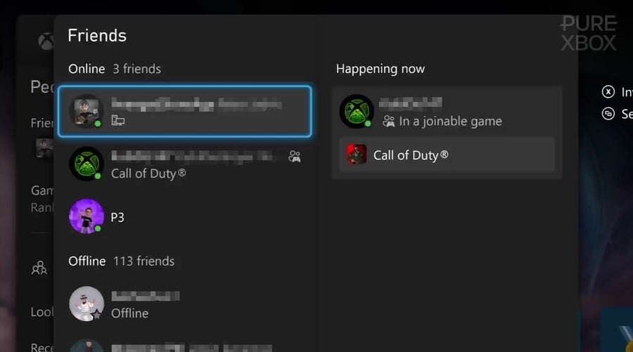
You may have seen recently that Xbox has begun rolling out a new social feature in the "Friends" tab that's known as "Happening Now", and over the past 24 hours, we've seen a lot of people sharing their opinions on this latest addition.
As you can see from the image above, the idea is to make you aware of all the active games and parties you can join at any one time, but some of the images we've spotted online make it look a lot more cluttered for certain people:
The reactions to this "Happening Now" tab seem to have been very mixed so far. There have been a lot of people sharing similar posts to the one seen above, with words like "ugly" and "hideous" being thrown around (along with a lot of requests to disable it), but others say that they actually think it's a good addition to the Home UI.
Here are just a few examples that we've spotted on various Xbox subreddits today:
Whether you're a fan of Xbox's new "Happening Now" feature or not, it looks like it's here to stay. Of course, the dashboard and UI are always getting tweaks based on feedback, so some of these reports may result in a few changes.
We'd be interested to know what you think of this new feature below, so please let us know in the poll and comments! Do you agree with some of the negativity, or do you fail to understand what all the fuss is about? Tell us below.
Do You Like The New 'Happening Now' Feature? (230 votes)
- Yeah, I think it's great!
- It's alright I guess, I'm fine with it
- I understand the negativity, but it's not a huge deal
- I hate it, let me disable it Microsoft!


Comments 13
It's fine. How long do you plan to have the friends list displayed on screen? Isn't it usually a quick check and exit? If anything this should lessen the time you need to find the friend you want to join or message. I don't see the issue with "clutter" for something I am not planning on looking at for more than a few seconds at a time.
Never pass up an opportunity to complain seems to be the internet motto (especially with xbox) so I'm not really surprised this insignificant change is getting pushback.
It’s no problem for me because I don’t have any Friends.
I am the epitome of indifferent.
I wasn't even aware of this feature, but let me check it out and get outraged afterwards 😅...
I think out of the three systems xbox got the worse UI. And the achievements need a serious overhaul.
Xbox, for all its innovations and technology, really... REALLY ****ing sucks at UI/UX. Seriously.
How, after multiple iterations and designs across the 360, Xbox One, and Series consoles, they settled on this travesty of an interface is beyond me.
@BacklogBrad They asked us for our opinion.
@ZYDIO it was more directed at the reddit posts cited in the article that make it seem like a dire situation because their friend list has more information than it used to.
"This NEEDS to either be reverted or have the option to turn off because its JUST awful" lol
Xbox 360 used to be really great for social features, voice chat and parties. I would never use them now because you can lose your whole account, purchases and progress just for cursing. It’s lame.
@BacklogBrad Oh ok, cool. Yeah it does look absolutely awful. I don't know what they're doing lately. I used to like going around in the UI and doing whatever, now I avoid it at all costs. Turn on Xbox, start game as quickly as possible and forget about the UI.
I'm a UI / UX Designer and holy. Xbox really have the worst UI ever, I opened this up yesterday and was kinda shocked. It's really in the way. The happening now was fine the way it was before the change.
Should give you the option to turn it off if you don't like it.
I hate it because it open a second friendlist of the same peoples playing the same game it's probably the dumbest feature ever implemented by team xbox i hope they will remove it completely i don't see the poing can someone tell me what this list purpose is for? Because currently it only show what players currently play but you can already see the same thing in the friendlist. 🤦♂️🤷♂️
Leave A Comment
Hold on there, you need to login to post a comment...