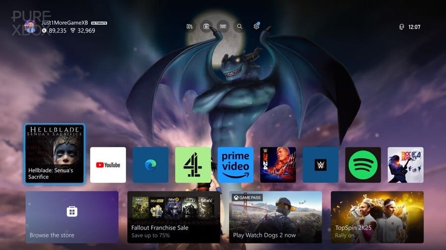
It was all the way back in September of 2022 that Team Xbox first unveiled a new dashboard interface that would be tested by Insiders over the next year, with the intention of incorporating feedback into the final, public version.
The feedback was mixed to say the least, with concerns around backgrounds being obscured, adverts taking up too much space, and a general feeling of crowdedness. As promised, that feedback was taken into account for the final version which arrived in July of 2023, but although it was an improvement, it still didn't receive unanimous praise.
At the time, we polled the Pure Xbox community on their thoughts about the new dashboard, with the majority of votes suggesting that it was "moving in the right direction, but needs changes". Some actually said they preferred the old dashboard, but plenty of others actually said they thought it was a huge improvement.
Clearly there were some varied thoughts about the new design back then, but now that we've had almost a year with this UI (with a few adjustments thrown in along the way), we're very keen to find out what you think about the Xbox dashboard as it stands right now. What are your likes and dislikes about it? Tell us in the poll and comments below.
What Do You Think Of The Current Xbox Dashboard? (754 votes)
- I think it's fantastic, no complaints here!
- It's pretty good, aside from a few minor complaints
- It's OK, but there's a lot of room for improvement
- I don't like it that much to be honest
- It's terrible! I hate using it!
Almost a year on, what do you think of the current Xbox dashboard? Come and let us know!
Comments 49
Way too much going on. Feels more like an ad than a user interface
Too much Gapepass forward stuff instead of prioritizing player's customization.
What's better is they keep releasing these "dynamic backgrounds" where the majority of the dynamic elements are hidden by the dash.
In typical MS fashion it’s cluttered and bloated. Why is there 2 places for the store? The ad’s are still a joke when Sony and Nintendo don’t have them. You can’t customize the underneath stuff to your interest. It needs a lot of fat trimmed off. Needs to be 4K HDR like the PS5 and they need a new refreshed page to the achievements tab. The foundation of it is good, just needs some spring cleaning and updated content and it would be very very good and fast.
I think it is way more focused on advertising and selling me product than it is about being a usable tool for me to navigate and use my system.
It's the epitome of meh
It‘s all about ads. I can‘t find a way to hide groups and arrange/sort own groups. Crap!
It’s still just too much all over the show.
Needs to be simplified and all the bleeding ads removed.
It’s still third out of all three for me.
Switch
PS5
Series x
Full of unnecessary stuff and still not easy to set up menus as the other two.
But Microsoft are used to Xbox being third, so there is no shocks to be had.
I like it to be honest.
I think what are seeing is the difference between USA and Japan company design.
USA, stick everything up front that you can advertise and make the set up menus etc not learn.
Japan, keep it simply clean and lean, with thought out set up menus within reason.
Unfortunately why I have just had to buy a new Honda Civic instead of the regular new Ford focus. It was hard to leave Ford and the Focus but then they went and put 1.0 litre 123bhp engine in a focus and the only engine you can have, apart from the ST of course. This whole electrical thing and removal of the fiesta and focus from Europe and the UK will finally kill off Ford in Europe and the UK. And don’t ask what they have done with the new 2024 Puma.
Every new or newish car I see now is Kia, Cupra, Honda, Toyota and some German makes.
Oh Ford what have you done. Sorry about the rant.
PS, the new Honda Civic Sport UK model is amazing.
The new dashboard has too much advertising and not enough customization, especially when it comes to the two group limit. I have half a mind to get a mid-range PC and Chimera OS, mind you the dashboard isn't the only reason I'm feeling that way.
Absolute bollo**s
It already needed more customisation options. The limit of home screen groups was frustrating but I could live with it.
But that got nerfed even further down to 2 groups and a bunch of ads for stuff I've already bought and paid for. What a waste.
Can't believe they are legally allowed to remotely nerf your console a year after you've bought and paid for it.
It's a bit better nothing special don't really mind the ads to much myself there should be more customization of the home screen but it ok
Big minus that you can't bring your own groups to the very top.
It is nice when it comes to the organization of the games, but them littering the remaining spaces with ads for games and a bunch of non-game services is so terrible. Maybe one or two ads would have been fine, but why fill almost all the rows with them? It’s a game console, not an advertising console.
In general I like it. I know people complain a lot about the publicity below but I really like the shortcut buttons at the mid top and the wall papers for game being played
It's not perfect but I think it is my favorite of the 3 home console platforms. I think the steam deck UI might be my overall favorite though.
It's busy but once you learn it it makes everything easier to do than the equivalent on ps5. PS5 requires to many button presses to do almost anything and pressing one too many makes you restart at the beginning. That's my least favorite console UI of all time. I think it must be meant for disc players where putting a disc in brings it up front. Don't start me on deleting things and changing what drive its on.
Switch. It works. It does little. Has a lot of the same problems ps5 does but having a touch screen circumvents some of the headache.
Xbox is crowded and the settings are too spread out on menu tabs. Ads suck. But it's way ahead of the others in managing large digital libraries. Which isn't really surprising.
Hate the current Xbox OS to be honest, pretty much only exists to force more ads on the user. You can avoid some of the problem with the OS if you only play at max a few games, but some obnoxious things remain like the full screen ads on console startup and games getting the "too long to start" error.
Switch is the only current system with a fantastic OS though with the only problem being the eshop is too slow. Very basic but that's a good thing as the focus is getting you into your game as fast as possible.
A promotional service piece of software with plenty of bloat is what it is.
As a physical customer, I couldn't care less, let me put the disc in and instantly start playing it without the always online updates, stores, subscriptions and everything else, it now feels like a media box not a dedicated gaming console and that goes for all the others.
Going from the Switch to this I always feel like I have to search to find my games. Not a fan personally.
Answer depends on if we stay at the top or if we scroll down.
Utter hot garbage, a complete downgrade from the previous dashboard in every single way; pretty much nothing was changed on the homescreen except a few extra icons at the top, 90% of the "updates" are below... where they have now made it impossible to pin more than 2 game groups to home, whereas before you could have a dozen or so, this is a BIG deal for people with a huge collection (350+) like myself who had everything organized by genre, now pigeon-holed into 2 groups of 40 visible games each max.
But before you can GET to your home groups, the FIRST row below home, which CAN'T be removed, is basically an AD for "top X games" (top new, top free, whatever), and below the MAX 2 group pages, EVERYTHING else below that is fixed to more ADS! So it was an "upgrade" for Microsoft and a DOWNGRADE for CUSTOMERS CUSTOMIZATION.
There was TONS of outcry on Twitter when it came out, and of course Xbox completely IGNORED all of the negative feedback, because why should they care at all if the piss off literally their entire installed user base? What can we do about it?
I’d change a few things, but it’s so much better than the PS5 UX/UI. Everyone time I play something in my PS5, I’m annoyed that is doesn’t have quick resume among other things.
I actually think it's pretty good, but they really need to improve the background situation.
@OldGamer999 A fellow Honda Civic afficionado. You sir, have good taste.
I've never owned a Honda, but I can see why people like them.
As for the Xbox dash. I can't see why people like it, it just screams corporate greed.
It was much better when we could have more than two groups on the home page, and we didn’t have to scroll past an extra ad group to get to them.
The biggest issue I still have with it is when I insert a disk, the icon to play the disk appears over on the far right. It never just pops up on the far left.
@OldGamer999 your comments should come with an autism warning at the top.
Bring back the blades!
Well I kinda like it. It's kinda clean, but there is too much advertisement really.
Wish I could customize what kind of content appears as you scroll downwards.
I'd rather hide most of the stuff that's there and get in some library view or being able to have tabs of your favorite games instead of store recommendations and community stuff.
Better than how it was before but I’d rather have the choice to customise the Dashboard. Think I’m probably the only person that would love them to bring back the original Xbox One Dashboard.
I never notice the ads. I think my brain is just wired to completely disregard most ads at this point.
I would say it's fine. It's better than the PS5 which is a nightmare to navigate. Slight exaggeration but PS5 has the worst UI of any console I've ever had. I still get annoyed when I turn it off.
The worst thing about the Xbox UI is that when you back out of something it takes you to the home page instead of one or two steps back. Other than that it's pretty intuitive.
The whole FU©K!NG thing is a game pass ad! They took away my groups and replaced them with ads! I didn't realize that I'm still pissed off about this until I read this article. I did some research on this. I have figured out that legally, we can charge Microsoft or any company for that matter, for advertising space on our screens. We can send them a contract asking for absurd amounts of money. I am asking for $10,000 per pixel per frame per second for example. If they do not respond or agree to said contract, which they won't, you can get a cease and desist order from a judge to force them to remove the ads. You can also claim that they changed your contract without your knowledge or consent. Contrary to popular belief, hitting an agree button is not legally binding because they cannot prove who who clicked the button, plus there is no disagree button. It's a funny trick they try to pull with that, they try to force you to agree to a new contract or deny your access to your device and content and that is illegal as well. If you have a contract with them that grants you access to a device and content they cannot take away access and content because you do not agree to a new contract. Both sides are still bound by the current contract. I found out they had to change the terms of service to allow the dashboard to contain ads and I never agreed to it. Also even if someone agrees to it they can always change their mind at any time and send Microsoft a letter in writing stating such and then at that time they will be legally required to remove the ads. I say everyone do this so these companies cannot take over our devices and get free advertising space in our homes. I think everyone should demand absurd amounts of money for advertising space on our TV screens in our private homes. Maybe then they will stop doing this or maybe everyone will get paid if we present them with a reasonable offer. Rant over.
I never had an Xbox One, but what I’ve seen of the mid-2010s dashboard seems much, much better than what’s there now.
I just want them to get rid of the “Browse the Store” button… (and not replace it with a fourth ad)
@Jey887
Yeah just got the new one on the 1/3/24.
Day one as us gamers say for new registration 😂.
Went the civic sport and loving every drive I take in it. My first automatic, so smooth and easy to drive.
@Arkz
Definitely on the spectrum as everyone is to some degree. I’m pure aerospace engineer trained to degree level, so that probably doesn’t help 😊
It's utter garbage meant to shove advertisements down our throats. Easily the biggest turn off for Xbox use.
Worst console dashboard/OS/UI ever. Not only is PS5/Switch also got the trash libraries focus then the folders of PS4/Wii U so thanks those two for taking on what Xbox offered most of the gen and continues to. Too much network hogging trash. Worst thing I've ever seen. I'd take Windows 8 because I didn't hate it other than the apps in the background not closing so I need task manager every time for them.
But I'd probably take Windows ME over this garbage. It's Microsoft's/Xbox's worst OS ever, visually or functionally.
The Xbox store doesn't even close properly even for updates. Thanks Microsoft. I can get around it but in a stupid way.
The quiet from POST is great still and it took Sony till PS5 to do this.
The what you have in your library is stupid. It displays demos because oh digital focus and digital services. My disk stuff appears but even still I put groups for them in games and apps but some icons don't appear correctly. The disk/none and what not icon I should have memorised by now. I still don't because it's not clear but I just put the disk in and treat the console like an OG Xbox disk in play. Maybe some music from Soundcloud and that's it. Or a blu-ray if I feel like it. Simple. Barely use the console because it sucks.
More network hogging garbage of achievements and ads and utter nonsense. The fact Sony goes we do or don't have ads for the PS store deals on occassion aka rarely to never anymore says a lot when Microsoft wants as much real estate for ads and other nonsense as possible.
I'm not into minimalism I'm into not wasting my time with nonsense on a device and Microsoft just loves to have network sucking garbage on both the Xbox One/Series consoles. It boggles the mind. They can have the telemetry but I'm not interacting with any of it I don't need any of it. It took me years to even understand or care about he record feature why because I don't need it.
I'd rather the gestures tutorial for Kinect or the Windows 8 style apps side view in the 2013 dashboard besides it's garbage ads placement of 360 too then the garbage of these days. But I use an offline 360 so I don't see any ads.
Goodbye customisation the last one had because Microsoft needs those ads to appear. So I have 6 layers of garbage I can't remove that makes the Xbox One X chug because of network sucking garbage on the dashboard. The One VCR probably performs even worse.
I'd still prefer the Xbox One/360 era last one over this garbage. I hate flatness but it's navigation is a pain. 2010s flat wasn't that painful even if I preferred Aero and more variety of the past. Not the digging flatness so much further and in worse directions I can't even look at it without being confused or just annoyed at seeing it everywhere.
To me any web design/UI design just makes me want to look the other way it's so vile. But if I was forced to design them that way I wouldn't want to be making them I'd make something else.
I can't even close the Xbox store properly because of the way the app works. It's so bad. That's like Windows 8 task manager level annoyance of apps not closing properly I remember as it happened A LOT on Windows 8. 10 year old design Xbox can't even get right apparently.
Why should it matter it's because the app doesn't close so it can't update. Brilliant 10/10 UI and back end software design Xbox you don't get a gold star for such terrible design to get the console to work.
It's unacceptable filth software design. 0/10 Microsoft/Xbox team should be ashamed for such terrible coding, terrible art design and no concept of anything for navigation or functionality other than business model advertising, network hogging apps/thumbnails/live title filtering nonsense and just a lot of garbage decisions.
Stop selling us a under the TV billboard and give us a console you cowards.
If it weren't for backwards compatibility or say 4 games I care about on Xbox One (the rest of many 1st/3rd parties aren't worth my time). I'd sell the thing it's a piece of garbage.
It's bad. Too much visual pollution for my taste, hugely confusing and unpractical.
The 4 big boxes kinda ruin it. It would also be better if the little boxes showed installed games only, instead of games and apps. But still in the recently used order.
It looks ok to me. Better than the PS5. Their Dashboard is too empty, at least with this one you can have a background picture and the games/apps are easy to see. It just runs slow and sometimes the console has to be reset to make everything work.
I don't find it intuitive and hate the adverts. There's a lot of hate for the PS5 UI in here, but it's infinitely preferable to this for me, even if it does need a good sort out!
Every time they update they find new and creative ways to make it worse... Too many ads, too slow on Xbox One, and they removed customization options. Makes the Switch's bare bones UI look amazing, which is really saying something.
It’s fine enough, but I don’t love it and haven’t loved the design language ever since it was brought in with Xbox One. Would love a 360 style NXE style release that completely overhauls the experience. Not that I want NXE specifically, but in the 360 gen MS we’re willing to really experiment with the dash and I’d like them to take a go at something at that scale again.
Honestly of the three consoles, I probably like the switch the most for its focus on my game library. Could maybe do with a few more options around filtering and sorting things, but I do like that the games are the focus of the entire UI. Their store apps slow and cumbersome however, and other online options missing compared to the competition. Otherwise I like it, and I feel like my library feels better integrated than it does on Xbox where the My Games and Apps is an interface I find oddly disconnected to the consoles main dashboard (which is where I really want a full list of my games, without me needing to Pin them).
PS5 is OK also, like Xbox, but don’t necessarily love that either.
Incredibly dull with no personality won’t be remembered like the og Xbox or the 360 blades
When I turn on my XBOX, I just tend to immediately select my game and play. Sooo... I took the time last night to sit back and study the dashboard. I scrolled up and down a few times, and... Well, I'm not that offended by it at all.
All my recent apps and games are on the top row for easy access... Gamepass related icons are below, followed by a few other icons I didn't really pay much attention to. So I continued to play Assassins Creed 2...
It does the job... 😊
The landing page is OK, just not organized like I would want it to be. Go 'Up' to get to your games or gamepass, that's ok. Everything 'Down' is a worthless never ending trash heap.
It is great.
Sony is boring and bland.
Switch is boring.
Leave A Comment
Hold on there, you need to login to post a comment...