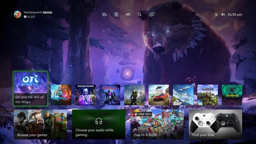
After months of testing, Microsoft has finally unveiled what a new Xbox dashboard could look like with its latest Xbox Insider 'Home experience'. The new home screen layout, pictured above, is arriving for Alpha Skip-Ahead and Alpha Insider rings later this week.
Most notably, the new dashboard finally allows for a bit more breathing space for background images, with all of your recently opened tiles shrunk down to allow for more room up top.
There are other changes though - some more subtle than others. Right at the top of the screen you'll notice a new "quick access" menu featuring icons for your library, the Microsoft Store, Xbox Game Pass, search, and settings, and we like how nicely that integrates into the background image.
Finally, Microsoft says that this new Home experience includes a brand new feature relating to game art. Basically, "a responsive game art feature" has been implemented that showcases game-specific artwork when you hover over the associated dashboard tile. This looks a lot like the PlayStation setup that contains a very similar feature relating to recently played titles.
This isn't a perfect update to the dashboard layout, but it's a huge step towards fully showcasing background images and game art, so we're welcoming it all the same. Remember, this is still in its testing phase right now (the dashboard will move from Insider rings to all console users in the coming weeks), and we may see even more changes for the final version.
What do you think to this new dashboard layout? Give us your first impressions down in the comments section!
[source news.xbox.com]
Comments 49
Finally! MS has listened! Though it sure is taking a while to get launched fully, seeing progress acknowledges that they're listening.
Slowly getting there.
Can’t see why they don’t have just one line of tiles at the bottom and that’s it.
Looks a lot better but people will complain regardless
@Dezzy70 Thats a big upgrade, but man are MS really doubling down that they want the add’s on there. Get rid of the add’s and this Home Screen would be a 9/10 for me easily. Even with the Add’s I’ll give this a 8/10, now i want them to add HDR to the Ui like the PS5 and then move to the achievements page and give it a nice touch up.
Looks good.
I hope they also do something about the boring looking pin squares. It would be nice if we could choose from a selection of icons to represent our sections.
Does look better to be honest. It’s still not perfect but it’s definitely better that’s for sure.
I'll take it, it looks like a decent improvement. Hopefully it isn't too far away from those who aren't in the Alpha and Beta rings
@Dezzy70 How about no line of games?
You have a background screen and radial menus. The left stick chooses the section, and the right stick chooses the game within that selection.
That's how I'd do it.
Why do things like this take so damn long??? Just hurry up and fix it!
They just wont get rid of the ads
Looks pretty good. The second row is still awkward, IMO, the first tile is for library that duplicates the first icon on the top row now (love the top row), so it doesn't really need to be there, the audio icon is I'm sure a multi purpose icon but I'm not sure what it's for, and then of course the GP and general ads which they'll never get rid of, even Windows Server has ads on the Start menu.
Still, it has far more convenient access to get to your library than PS5 where you have to scroll all the way to the right, and then if you back out or hit the movie tab on the bumper you have to start all over again all the way at the left. Drives me crazy every freaking day. Although none of this is actually necessary because the Guide menu is the navigation for all things....I still don't know why XB has a home dashboard anyway, it doesn't need one. Guide replaced it.
Using it at the moment , takes a while to get used to go up the top to get to my games and apps Instead of the first tile below ( now the store ) but apart from that I'm liking it
@NEStalgia browse your games isn't there on the dash it's the store ,still only one way to get to games and apps and that's the top (apart from the guide of course )
https://files.fm/u/2nd6ed4tv
@trev666 they'll be there forever for a reason, and that reason is money.
People are happy about this?
All they did was.
1. Make the Tiles smaller and add 2 extra tiles
2. Move the ads and tiles down a little bit
So impressive.
They really are determined to keep multiple rows of tiles
Getting there, very slowly. Still don’t like so much space given to ads. And shrinking the top line icons has made them feel even more prominent. Shrink the ads!
@YouTrash you’re mostly right. Though there are a lot of other small differences. E.g. there’s now a row of icons at the top (search, library etc) but I agree it’s a joke it takes so long. Classic ‘Design by committee’.
It’s also no longer clear that you can scroll down to the other sections. Fine for those of us that know but it served a purpose being able to see the top of them. One step forward…
Looks good to me
@Total_Weirdo as a series X and PS5 owner if i could smash the two UI’s together i might have something, there are area’s to both i like better than the other. Sony needs to either use the card system or ditch it. It’s clutter looking to me and most of them aren’t needed or work as intended. Xbox Still needs to get rid of Add’s and fix up the achievements tab next, then go into settings and make it look more like the PS5, cause the titles from windows 8 in the settings is dated and clumsy.
@NEStalgia agreed, the guide is so easy to get around your needs. THANK YOU NES, the PS5 needs to let you move the games App Library icon to the front and put the PS+ tab into the Store and then move the store to the end. It make ZERO sense to be at the end(far right) that whole system is my least favorite thing next to the plastered cards, otherwise i like most of the PS5 Ui.
@Martsmall Strange the official shot above shows the "browse your games" tile there, and I'm pretty sure for me on the old UI the "my games" tile is there as well.
@Green-Bandit
Well some good series x news we only got 2 series x Forza bundles left, good sales.
Bad news, after that no series x in stock, zero.
We had zero solos series x for two weeks now.
Come on Microsoft get the act together.
@NEStalgia yeh maybe it will change to that by the end of testing we will have to wait and see , yeh it was my games and apps ,that the only thing I need to get use to going up instead of down to go to my games .....ok I admit I've done it about 3 times already and gone to the store lol
Much better, though the background is still kind of buried. The current layout is like you are trying to peep over a tall fence to see the image.
@Green-Bandit Absolutely. I'm pretty sure they did it that way because Nintendo did it that way. But they made theirs worse by resetting back to the left every single time you exit the library, and they have more tiles across before you get to it. I don't love Nintendo's setup either, but PS copied it and then made it more clunky. And then doubled down on making it works by making R1 move to the movies tab, and if you L1 back it just goes all the way back to the left of the home page instead of the games tab. You couldn't make a more unintuitive interface requiring more button presses to do basic things if you tried.
Though that doesn't even annoy me as much as the way the power menu is accessed with a short press then scroll to the end rather than long press like every other system ever except newer Samsung phones that at least let you remap back to that.
But yeah, Xbox UI is ugly but functional. PS5 is pretty yet falls flat as a functional UI. For such a lean and minimalist UI it takes more button presses to do anything, and makes you repeat the sequences, more than my old PalmOS devices..... I don't really love Switch's ultra-minimalist UI but it does at least manage to look good and be functional for the limited functionality it permits.
@Martsmall Haha, yeah, I do like the top row, honestly I wish PS and Switch would move to that too, IDK who ever thought of scrolling to the end of the whole list just to get to your library. For XB, it fortunately doesn't bother me much because.....why not just use the Guide anyway?
Maybe Microsoft should look to Steam, to see what a functioning, streamlined menu/interface looks like. I can't believe that this whole "improvement" is centered around seeing more of a background. It's childish.
@NEStalgia I like the top row too ,I'm just hoping that later down the line you can customise the top , I'm thinking all my non games up there , add in rewards etc
@Dezzy70 my guess is they are looking to get more Series X solo’s out and then go heavy on Bundles with Diablo 4, Starfield and maybe Forza Motorsport when it arrives. Have to see what they announce at the June event, maybe that will give a peak of what is coming. Some people might have forgot this but Phil said they liked some features on the Dual Sense and they were looking to add some of them to the Series Controllers, that was early 2021, i wonder if we will see those upgrades come and add that this year or next. Sorry that was a side rant i just threw at you cause it’s been on my mind the last few days.
@Green-Bandit
That’s ok I like a rant.
What they need is some dam big AAA sell the brand games. And early reviews are not looking that great for Redfall.
@NEStalgia they for sure took ideas from Nintendo and yes in most ways made it worse. It is a Ui that makes you button press a lot. I’m not a fan of that. But if Sony got rid of the cards, cause well you know they rarely work as intended if work at all, look ugly and cluttered etc etc. at least let us move the tabs in the game row. Then the game library resets your selection every time you power down, like how many times do i have to say A-Z. Xbox keeps whatever search i want until I change it. This might be nitpicking but i had the cross gen titles that if you only install the PS5 version it don’t say installed in the games list, it say’s PS4/PS5 2 items. Sony handled everything cross gen wrong for me anyways. I am sure i am missing a few things, but these all seem like easy fixes if they spend sometime upgrading the Ui. But when you ship 30 million units in a year and have your fanbase telling you you do no wrong, i think it’s unlikely to change anytime soon. At least us Xbox fan’s are vocal and MS does listen sometimes. Keyword: sometimes HAHA
@Dezzy70 yes they do and they have some in the pipeline, RedFall looks ok to me, not a system seller nor a light up the meta scores AAA that Xbox needs. I do have it installed on GP at the moment and will play it tonight when it goes live. Once Diablo 4 comes out RedFall ain’t getting no time from me, even with a 60fps patch. Unless somehow i fall in love with it and i don’t see that happening when i have been waiting forever for a new Diablo game.
I wish they'd let us customize page 1 as much as they do the rest... I'd like to be able to lock some of my most-played games to the home screen.
A big, big improvement and I hope they continue listening to feedback to refine this design some more. Being able to pin games to the top row would be a cool feature to have for example.
Looking forward to receiving this in the Beta Insider ring once it’s ready.
Now this is what we all want, good job!
I like what I'm seeing. Excited for it to roll out whenever it does.
@themightyant agreed it is a shame we need the add’s, but it’s possible that they have deals in place months out in advance with those and can’t legally just take them off tomorrow and need to fulfill the obligation. I agree with shrinking them tho in the future to make them less in the way. This is still an improvement in my view. Hope they go to the achievements tab next and give it some love. After that touch up settings and this is by far the best Ui of the big 3 after those updates.
I wouldn't even be able to tell there was a difference because I am never on this screen for more than a second. What are people doing in the Home Screen that this matter at all?
Something I have been waiting for is Xbox moving the "Play Disk" to be on the far left of the screen than the far right. It's a little thing but over time it becomes super annoying. Here's hoping they move that with this new update.
Why is the home screen not user configurable and how long does it take to resize some icons? They shouldn't have to wait for a whole new release just to have different size squares on the screen. Windows 8 and 10 start screens and start menus are configurable and resizable. What's so hard about having the same options on Xbox especially since it's the same operating system? Also, it looks ridiculous with small squares for apps and games while keeping the humongous rectangles for the ads. I know this sounds ridiculous but I am real close to leaving Microsoft and Xbox ecosystem because of those ads. I paid full price for the Microsoft products I own and it is absurd that I have to look at giant ads on my screen at all times. This isn't Google where everything is free and you are the product. Microsoft is trying to double dip. Am I the customer or the product? Pick one Microsoft and let me know.
If this nonsense continues, like I said I will leave the Microsoft and Xbox ecosystem. Which means basically my whole life of computing and Xbox since day one, which includes almost 900 xbox games, about 15 consoles and countless accessories that go with them that I would be selling. I might even finally just use Linux exclusively. The point is that they are crossing the line and it needs to stop.
OMG! There's a visible wallpaper Anyway, looks good and a step forward
@Green-Bandit They've been working on this for months, it has nothing to to with pre-exisiting deals. The ad's won't disappear either now or in the 3+ months, it's a conscious decision on their part.
I agree there are elements of XSX & PS5 UI I like and there would be an almost perfect place in the middle, for me it's just far nearer PS5's. I'd take that as a base and add a few features from XSX not the other way around.
Nice! I hope they will also reintroduce a Friends feed option on the homescreen. With achievements progress from all friends. Kind of miss that.
I don’t get why people want to see the background. It’s a background, not a foreground. Give me quick access to all the things I need, I don’t plan on staying here and staring.
This needs to be made Series-exclusive so upgraders finally feel a difference at the base level.
Honestly I just wish they would bring back the Xbox 360 Dashboard with the baked in store.
@themightyant Yeah PS5 Ui outside of the cards and all the clicks it takes to do something isn’t bad. Good to know they could get rid of the add’s and just aren’t. But overall this is a decent upgrade to the current Home Screen, so I’ll take it. It’s hard to get a Ui everyone likes and agrees with on any platform. I think Android on phones stink, it’s gotten better over the years but when i last tried it i was like what is this, but i have co workers and friends that feel that way about iPhone. Ui work is so important for devices these days.
This looks good except for the fact that we just got the option to have a solid color background that didn't show game art when you stopped on a tile.
Nice start. Now make the bottom boxes smaller like the top row. Then subtract 2 of the 4 lower box's , keep browse games and link to GP. Then add other links to the lower row like links to the internet, apps, and gallery.
I just got mine updated today. I like it I think it looks much cleaner.
Though I could only get the dynamic game art background to work if I set the background to the standard one (waves), if I chose any other background them the game art feature didn't work. I don't know if this is how it is supposed to be or if it's just coz I'm in the insider program and it's not finished yet.
It's good though! Deffo improved.
Leave A Comment
Hold on there, you need to login to post a comment...