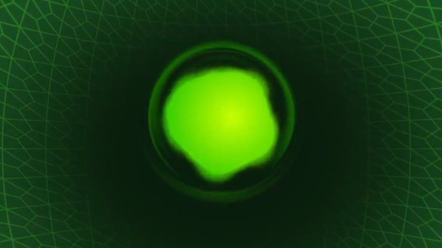
Last weekend on the Xbox Podcast, a number of fans spotted a classic Xbox dynamic background on Major Nelson's dashboard.
The May 2021 update for the Xbox Series X|S is now available, and included is a new dynamic background titled "The Original" - and yes, it's the same one Larry had! Here's a look:
To apply this background, you'll first need to update your Xbox Series X|S by entering the settings > System and then selecting Updates.
After you've done this, re-enter settings and select personalisation > My background > Dynamic backgrounds and then select "The Original" theme at the very end of the row. And there you go - you've now got an Xbox Series X|S with an OG background!
Have you performed the May update yet? What other retro backgrounds would you like to see released for the Xbox Series X|S in the future? Leave a comment down below.
[source twitter.com]


Comments 14
@Royalblues You know Twitter Campaigns don't work, just like petitions.
Yeah Xbox home screen sucks. It's also super ad-driven. Separately, I constantly hate being reminded my Gamepass is going to expire soon, wish we could turn that off
Wow! What’s going on here!? Man! Look at this! Awesome! makes ape sounds
Haha, great! I'm a fan of this background
Series X/S making history.
I think Xbox homepage is too crowded for dynamic themes. In this regard, I prefer PS5 home Screen, which is more minimalistic, and let the theme/background shine.
Now can they add the option to use the old blade dashboard from 360.
Love this, can't wait to get home from work to try it out. Also, i love the home screen! It's the best one yet! Not too crowded and the layout is great!
@Kilamanjaro I also wish I could turn the adverts off, far too many of the home screen tiles are advertising, I didn't buy an xbox to see this.
Nice! Finally managed to snag an X, it's getting here Monday, that's the first theme I'll use!
Why not add it to the Xbox one there basically the same os
This brings me so much joy.
I'm more interested in the "mote" background, having no particular of Xbox nostalgia, but it's a fun look. The centered backdrop needs that radial menu though. More is more like PS3, but without the awesome orchestra warmup sound (best console start sound ever) but with a menu that actually makes sense.
@Axlroselm The PS5s UI problem is that it's not just the home screen that's minimalist. It's the features, the store, and basically everything, folders when? I think PS5 will have game pass before it has folders...
love it, the best so far.
Leave A Comment
Hold on there, you need to login to post a comment...