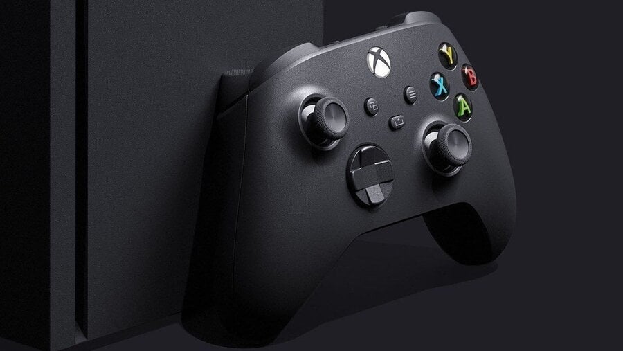
Microsoft has confirmed that the Xbox dashboard will be getting a revamp for the Xbox Series X. This was mentioned by director of program management Jason Ronald in a recent interview with Gamespot, who stated that more information on specifics will shared later in the summer.
Ronald told the website that Microsoft is "really happy with the early results that we're seeing so far" in regards to the next-gen dash, mentioning that the company is refining the experience based on feedback from players. He also confirmed that the team is "working extremely hard to make sure that we have a great day one experience both on Xbox Series X as well as on previous generations."
We're guessing it'll be more of a refinement than a major overhaul, then, with Ronald noting that Xbox Insiders will be seeing "various experiments at different times" in the lead up to launch. He concluded that the community response to these is "directly influencing the final shape of the dashboard that we'll ship with Xbox Series X."
What do you want the Xbox Series X dashboard to look like? Let us know in the comments.
[source gamespot.com]


Comments 15
The last dashboard I've worked with was the 360 one, and that was discombobulating to say the least. I'm sure the new one will be fine.
"He stressed that the community response to these is "directly influencing the final shape of the dashboard that we'll ship with Xbox Series X.""
Building a product around what your customers need/want is the way to success. I'm very happy about this. Now, about that new Achievement system... 😰
Nice, Can't wait to see the new Dashboard
I really hope they dont make it look as plain as the One UI has been since launch. Customizable and functionality is my biggest wish. And for god sakes, they need to stop throwing ads in our face on the dashboard. Or throwing Mixer in wherever. I have no interest in seeing spam from Mixer and other publishers in my Community tab
Thank god! The current UI is better than it was at launch, but it’s still too slow & clunky.
I expect it to evolve fairly regularly. X1 has continued to change over the years, I doubt next-gen will end that trend.
Just a simple list of games, with thumbnails, that's all I wish for.
Listening to the consumers? So we're FINALLY getting blades back?
@ThanosReXXX bring back da bladesss!!!
@ralphdibny All kidding aside, though: would be nice to have themes back, and then to the extent where we can modify our user interface to our own liking, including something resembling Xbox Blades, which to this day is STILL the most easy on the eye, and the most user-friendly Xbox interface.
I positively HATE all the Windows 8 and 10 lookalikes that we have now.
@ThanosReXXX I agree, custom would be great, blades were just easy to use and you could find everything. The Xbox one X was confusing at first especially coming over from PlayStation and Nintendo. I've got use to it more and there are certainly more things you can do with it than the other systems but I think I'd prefer it to be a bit simpler with the option to go deep if you need to. It's a bit like the focus is on the wrong things, I don't need 5 tabs to get to game pass or the store, just one for each will suffice and leave the rest of the main area for different settings
4K support in the dash would be nice.
@AJDarkstar I 100% agree. The NXE and XB1 dashboards have been horrendous in comparison.
I've used the guide to navigate the menus ever since they moved aeay from it.
It would be nice if Microsoft took some advice from Nintendo, the Switch has the best dashboard.
The only xbox ui I've had experience with is the current xbox one ui. My favorite view is the 'All Games' section. If I can have it so I get to a view like that when I tap the xbox button I'd be happy. What you currently see when tapping the xbox button should be triggered by a hold, not a tap.
Leave A Comment
Hold on there, you need to login to post a comment...