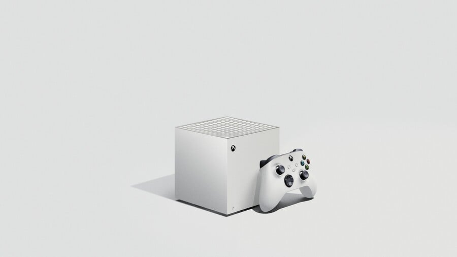
In the lead up to the release of the Xbox Series X this holiday season, talented individuals around the world have been creating their own themed concepts of the system. There have been designs based on series like Halo and Perfect Dark, and now we've got a concept that completely reimagines Microsoft's new console hardware as an 'S' model.
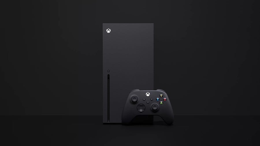
According to graphic designer and creator jiveduder, it's officially titled the Xbox Series S. Obviously, it draws inspiration from the Xbox One S – with pure white aesthetics, and is paired with a brand new Xbox Series X controller. For the sake of comparison, here's a photo of what the official hardware looks like:

Over on the Xbox One subreddit, many users noted how "adorable" the Xbox Series S was, and how it kind of looked like a GameCube. This isn't necessarily a surprise, considering how many people made similar comparisons when Microsoft first revealed its next-gen hardware.
Although the original Xbox kept the same look, the Xbox 360 underwent multiple revisions and so did the Xbox One over the long term. We suspect Microsoft has the same plans for its newest system, so who knows – maybe we'll actually see a design like the one above in the future.
What do you think of this concept, though? Are you happy with the look and design of the real Xbox Series X? Leave a comment down below.
[source reddit.com]


Comments 15
So cool & stylish! Like a modern gamecube!! I like it, I hope this will be its final form factor!
This would be amazing, if it looks like this. Seriously.
Xbox Gamecube!
I quite like it. Probably will be a bit bigger but would be pretty cool if they released it that size
It would make sense to be smaller and lack an optical drive for the Series S but the top would be flat to make the most of the smaller space.
That is hilarious and adorable.
Guys.
It's a bland, featureless box...
Like, I'm looking around my room now at all the past consoles and even the most boring designs have some sort of shape or feature to them.
I'm not sure we're all looking at the same thing here. I really do not see the appeal.
@BrilliantBill It's green plastic. The top is concave so you see the green part differently depending on the angle.
I miss my purple lunch box.
@Richnj
Cuboid IS a shape.
I'll happily have less power for that dinky design.
@Richnj It's a little sugar cube man, c'mon.
@gingataisen And a cute one for a console. The GameCube is the nicest console ever in my opinion.
Does it take discs or is it all digital? It's an interesting concept - a weaker Xbox at an affordable price. I think M$ should allow One X to be part of its next gen since it has 6tf compared to this @ 4tf.
@gingataisen I mean, I guess.
@BlueOcean I kept looking at my game cube when I saw this mockup. The CG is one of my favourite consoles. What I realised that the controller ports and disc tray, along with the lines and logos on it add character to the design.
Also, looking at the other consoles is I just prefer rounded edges and in interesting lines over straight edges and boxes. Like the standard xbox one and PS4 are ugly consoles. Especially compared to the PS3 or xbox 360 s/e. The xbox one s/x are the only ones that seem to pull off the look, but I think the grated look and two teir design really help.
Leave A Comment
Hold on there, you need to login to post a comment...