
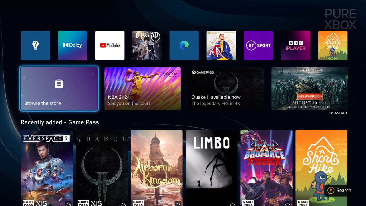
The new Xbox dashboard is continuing to roll out to all Xbox users right now, and in the meantime it seems to be getting some subtle updates as well. One of those updates has been spotted over the past 24 hours in the form of a "Browse The Store" button where the old "Browse My Games" button used to be, and it's not proving a popular change so far.
As you can see above, this button now takes you to the Microsoft Store instead of the "My Games & Apps" section, although the latter is still accessible along the small row at the top of the dashboard.
Here's what some Xbox fans have had to say in response to the change:
There are a few things worth pointing out in relation to this - firstly, not everyone is seeing the change yet, and some Xbox Insiders are also advising they've recently seen the Store button swapped with "Browse My Games" again.
In other words, as annoying as this change might be, there's a chance it won't be permanent. Team Xbox has consistently talked about the desire for feedback on this new dashboard, and the poor response to the big new "Store" button potentially means we won't have to deal with it for too long. We'll see what happens!
What are your thoughts on this? Tell us down in the comments section below.
Comments 107
Microsoft's games output has been spotty for years, and the dashboard is what some people are getting upset over?
My wife is gonna be confused as hell trying to find Disney+ tonight.
All that training down the drain.
It's easily the worst dashboard of the big 3. And now with more worse! I saw this new change last night...someone in marketing should not be in charge of UX.
all they wanna put store and ads and more ads
I don't even have the new Dashboard yet, so I'm still safe.
I got a shock last night when I booted up the old one x! I forgot about the changes
So not only are they refusing to address the utter up selling ad infested disaster the new dashboard is, they are now making it even worst by removing what little access you had to 'your' games. It has actually put me right off even using my Xbox. Neither Sony nor Nintendo do this. In fact I may trade the Series X in for the new Switch when ever it's launched, may, all depends on how Microsoft approaches its awful dashboard mess.
JUST LET ME CUSTOMISE ITS LAYOUT!
I was so confused this morning when the tile was changed and I was looking for my game and apps (I had just woke up)
And
I HATE IT
I hope they change it back I don't mind the new dashboard but when you keep moving things around just as I've got used to it no one is going to be happy
Just a push to get more and more money from us. They seem to be really pushing hard for more revenue. And making a right mess of what could be a good dashboard.
But I suspect we will still have people defending it.
@S1ayeR74 I put mine on the shelf last night. I got so annoyed with this new change. I don't wanna deal with being bombarded by Ads to play some games. I'll stick with PS5 tyvm.
@S1ayeR74 B-but more ads makes more money, and money make shareholders do happy. You do want them to be happy don't you?
@PsBoxSwitchOwner people defend anything xbox do if phil Spencer took a dump live on air people would defend him lol
Christ you'd swear it was impossible to find your games the way people are crying about it. It's new, you'll figure it out. No need for the over-reactions.
Not a fan either. The larger background image is ok, but not being able to customise things as easily like I could before is a problem. Feels like something has been taken away rather then added!
@Krysus no exactly Microsoft make enoughoney as it phil Spencer is a complete joke I can never get over the redfall situation and 30fps a 1st party game as well go look at the 1st party games nintendo or Sony Churn out
mines always said browse the store since it updated.
I still keep pressing it because I think it's my games and apps 😭😂
@Dan1283. funny you mention Sony as look at the Last of Us remake on PC. It was in a similar state as Redfall.
They should revert this back to my games and apps as it's a disaster!
The Activision acquisition is no doubt to blame for all the recent bad changes to Xbox.
MS really wants us to buy things, huh? Haven’t bought a game on Xbox for at least five years though. Thanks Gamepass? I swear, they might as well turn the whole page into an ad spread at this point.
I don't like it but I don't hate it.
I just don't care for it.
Ideally, we should be able to customize what goes where.
Oh no, it's the end of the ***** world... wait a minute, people actually use the home screen to navigate?
Its pretty awful, it just feels like endless adds and plugs for Gamepass. The PS5 dashboard isn't perfect but its far better then this mess.
@cragis0001 I don't know about that I know it just a money grab that game was they are all as bad as each other the only difference is nintendo and Sony release great exclusives unlike Microsoft who don't release many if any up into starfield let's hope its great I don't like Sony or Nintendo scummy companies
Mine has been like this since it got updated. I hate this new home screen, it's so ugly and unintuitive.
Just tested mine and I have this latest update. So now I literally have one line of my stuff. And without scrolling down now I have a line of bigger icons that are ads. Browse the store. These are the latest games blah blah blah.
Counted 15 lines of ads now. I cannot move my pins to the top either. I have to scroll through the ads to get to the 2 I'm graciously allowed to create.
It's just really crap, really crap. Designed purely by the marketing team. They have made an already bad dashboard even worst.
The “My Games and Apps” tab is now in the little menu, top centre of the screen. So rather than pressing down, you now press up, instead.
Easy. I really don’t know what people are complaining about.
I cannot be the only person who actually thinks that this is an improvement. Can I?
I agree that there are a lot of adverts, but I will likely only ever pay attention to the very top five rows, and do not care about anything underneath that. And (sarcastic) you do realise the very first adverts you see are a list of FREE GAMES?
Top row is all the games and apps I have played recently. As usual.
Second row is the store.
Third row is FREE games - don’t care about this one.
Fourth row is Quick Resume - in my case, right now Dragon Age Inquisition
Fifth row is my Starfield pin, getting ready for September
Sixth row is friends and community
I will probably never even look below that.
Push up the thumbstick once and you'll land on the games and app section. So you'll never need to scroll down unlless you want to. I rarely use the dashboard anyways. I tend to not care about things like that too much. The majority of users won't care as they are just focused on the games.
Why is anyone suprised that a Billion/Trillion dollar software company wants to sell you... software! They didn't get rich for nothing.
As long as I can play my downloaded or bought games I don't care about the very few ads. Plus I like browsing the store to see the sales and watch trailers of upcoming games. Third world problems.
They fixed the wishlist bug but now I don't even see which games on that wishlist are on sale.
@DoctorJohnDisco lol ha ha
I love the minority defending this but they're missing the point. Microsoft are treating you like a chump, these changes aren't for your benefit and it's all about monetisation. Your screen space has become their store front, rather than a convenient way to navigate to your games.
The whole dashboard makes me more miserable, it reminds me so much of steam big picture mode, the old dashboard had a cozy, warm feeling, this new one is too small, cluttered and less personal period.
They really should add a new option to console personalization and allow people to pick from the various different dashboards Xbox has had instead of forcing one on us that essentially takes away from everyone having their own unique little dashboard.
@Darylb88 my thoughts exactly, you push literally one button up and you're at your games and apps section. The random outrage people have for the dumbest stuff is crazy. I turn on my system and immediately go into my game. don't even spend time searching the dashboard.
Seems Microsoft is giving Xbox the Windows 11 treatment. Changing what nobody asked to be changed and telling you if you don't like it buy a Playstation. So Playstation sells more consoles with Microsoft's help.
@robe they are fanboys that's why
Yeah, I also miss some features. XBox is making mistakes with every update.
It's right there on the Guide Button. Where it's been since Xbox One. Which is the GUIDE button. Which is where everything useful is conveniently located without even having to drop out of a game to the desktop. Why is anyone trying to use the desktop? It was never useful and always redundant! It's a wallpaper for when you reboot twice a year.
The new dashboard is like a row of billboards on a highway that's funnelling users toward a mall, not the personal gaming machine that most people want.
Dang, how are people this upset over this? The my games and apps button is at the top of the screen in the new quick access icons. It's literally just one click up on the controller. It's a lot better than the old system. Everything is there on one screen and you can then scroll down to the other crap if you want.
Why somebody would defend using 60% of screen real estate for advertising is beyond me. Probably the same people not using ad block on their computers..
Changing the placement of the dashboard is the natural path of progress, and there will be slow adopters and people resisting the change. Some changes will succeed, others will not. But that is not the issue here. The issue is over-monetization and product placement all over the screen that BY PURPOSE is not a storefront.
@NEStalgia that’s the issue. They want people to use the guide button but people insist on using the desktop. Like people who don’t use folder on their PC.
It has been a mess. Gives you more background on one hand, but everything else is awful.
It really seems like Microsoft is intent on doing everything the exact opposite on ,box of everything else. Even so far as that they still refuse to use gyros, something everyone else has included since the Ps3 and Wii. Hell, even my TV remote has a gyro.
Each dash board has gotten more and more ad heavy. You know where I don't have to deal with that? Literally every other platform. If I am paying a premium for your console and a premium for your online services, I should absolutely not be seeing a single ad
@cragis0001
Exact opposite actually.
Redfall runs like ass on Xbox but great on PC.
Last Of Us runs great on Playstation, but is poorly optimized for PC. If you have the right hardware, though, it still runs great. And to boot, they didn't cater to inferior hardware like Microsoft does with the S and tits parity clause.
Moral of the story, Sony makes sure their games run great on their consoles. Meanwhile Microsoft lets their console owners take the shaft.
@Grumblevolcano
Microsoft has been having issues waaaaay before the merger.
Finally....an easy way to get to the store!
I don't like they way MS interleaves my stuff with theirs but as others have noted, navigation is super easy.
If you're willing to learn it, Xbox has far and away the best console navigation I've seen.
The one thing I absolutely can't stand is the Netflix-like categories as an excuse to push more games at me.
@Krysus It's a ridiculous update. I seriously doubt there's any great swath of Xbox users clamoring for a greater view of their background at the expense of squishing everything.
@Bobarino as somebody very involved in UX and interface design, one of the indicators of bad design is that people have to learn it.
Good design feels natural and PREDICTABLE. By the way, MS used to know that, as it was one of their key principles when designing Office tools
@InterceptorAlpha that's definitely true as the price of xbox gamepass ultimate compared to pc gamepass
@robe Yes very true, ignorant fans really. Not realising the issue isn’t oh just click up to the tiny icons at the top of the screen. No it’s the relentless MUCH bigger tiles of ads on your screen, on a premium product you bought, and a service you subscribe to.
I would say it’s like buying a car new only it’s covered in advertisement stickers and billboards on the roof, but even that misses out the Gamepass sub bit.
InterceptorAlpha
I know it was a typo, but I was having a crap day and this made me smile. Thank you 🤣
@Dan1283 Even more so when you can cancel Gamepass at any time on PC and still get to play online any game you purchased with the Gamepass discount. Since neither Gamepass nor gold is required on PC for online gaming.
@Markatron84
Ayooo. 😂 I'll leave the typo just for you!
Screw their store.
@InterceptorAlpha Microsoft don't care at all about xbox gamers at all hence how they treat us with their shoddy 1st party games or lack of them and 30fps releases and delays and price increases to gamepass its all bad management
I mean it wouldn’t be my first choice but you literally press up on the Dpad once and get to your games, people going on like it’s hidden behind 10 button presses. Calm down 😂
Whilst Im not gonna lose any sleep over it, its a shame that an opportunity for good kudos for finally updating the dashboard is squandered by preditory marketting.
I'm not personally suprised, as I have a dim view of MS from watching so many decades of how they operate. It is however a reminder that the xbox division is firmly under corporate control, which is a shame as I feel they would be more pro consumer left to their own devices.
Still, its only a press up and try to ignore anything else, but I worry its a sign of the direction xbox will be going in for the near future. Hopefully not.
Push your thumb stick up. There crisis averted
@InterceptorAlpha They have had problems but it's been becoming increasingly frequent at different stages of the Activision acquisition. In the early days of the acquisition (it was revealed to have started in November 2021), there was the infamous Halo Infinite mess where the game was forced to be released when it wasn't ready. Then there was stuff like the situations regarding Redfall and Starfield. At the end, a load of Xbox things made worse over the past 2 months while on the acquisition side of things there was stuff like the FTC trial, FTC failing to get an injunction and the CMA reopening negotiations.
It's like Microsoft sped ahead with making Xbox worse when it became very clear the acquisition was going through. Fortunately with the CMA taking their time, Xbox players are noticing these terrible changes to Xbox and voicing their problems with it rather than going "that's ok because CoD is on Game Pass".
@Bobarino : "The one thing I absolutely can't stand is the Netflix-like categories as an excuse to push more games at me."
Maybe I'm alone in this, but I'd definitely prefer a dashboard with user-made groups on the left that are hidden when you explore games in each one, along with the option — not a requirement — to have groups that display new Game Pass titles, new titles in the store, and titles ranked by popularity. Add the option to view a "manual" for each game with the Menu button when a game's icon is selected, and you'd have my dream dashboard.
Just got the dashboard update on my Xbox One last night and I like it, Think it’s much better in my opinion. Don’t really have any problems with it.
I know this is probably going to get some backlash from some of you but here I go…
I wish they would set up the dashboard like the PSN dashboard where they have your games and the “1” PlayStation store button as the 1 row of large icons and then the smaller row above them that hangs in the background for the non game icons. I just get a sense of serenity when I log onto my PSN unlike the anxiety I get from Xbox’s cluttered mess of a dashboard.
Don’t get me wrong, I like both systems respectively, I just feel xbox needs to be simplified like the PSN.
This is a non story, the games and apps are at the top, the new dash is fine
@SecretAgentCat Sony Dashboard looks nice, but then you open the god awful menus and the cluster feck of it all is poor.
Plus you get loads of stuff added later, like Pins and Folders, can take years for Sony to sort, plus tons more scrolling.
@SecretAgentCat It's horses for courses, Xbox has better Ui overall with fast parties and the excellent snap menu from the left, that is customisable and fantastic and fast.
I found Sony UI confusing and a mess, not that I've used it much, but when I tried to at a friends, was weird.
I do appreciate the minimal look of the PS5 home page, but everything else is a bit plop
Happened to me too. I don’t like the change. I want my old My games & apps tile back. I know it’s pinned on the top shortcuts row, but so is the store. I’d prefer two ways to access my own games than two ways to access the store.
Just another level 4 storm in a tea-cup amplified by rival fanboys outrage 🤣🤣. The closer we get to Starfield's release the more aggressive they're becoming...
@robe Yeah it's odd how some people will aggressively defend every anti-consumer decision some big corporation makes. It's like they're being paid to defend these decisions or something.
@Zochmenos By using the term "cell phones" you' confirmed you stand among the accused. I know I have an instructional floppy about that somewhere.
@mousieone Seriously, like the Guide has existed for 2 generations now. It's the standard way to do everything on Xbox. It has been for ages and ages. How are people still trying to use the desktop? It exists as a formality, it doesn't actually need to exist at all. I think MS kind of gets that point and some people are missing it. The "dashboard" is just becoming part of the storefront, because the dashboard is just part of the storefront, the actual UI is in the Guide. Where it belongs. Because you just bring it up inside the game. Meaning you never actually see the dashboard, unless you're trying to go to the store....which you don't need to dashboard for that either. It's an obsolete interface nobody sees between reboots. Of course it's just ads.
@NEStalgia your the reason I used the guide button now. But yeah I think the guide is where they want to direct people but people like the main area. But MS needs to do a better job explaining the guide button.
Honestly, Xbox always says they are always listening for feedback on the dashboard but only implement a feature the community asks for with other changes we didn't want. 5 icons on the menu for the store but less customization in terms of layout and Game Pass ads up the butt shows where their priorities are. Such a lackluster generation so far from both Sony and Microsoft
@NEStalgia Ive always done this out of habit but I see why folks are pissed off. That said, there are more important problems to be vocal about
@mousieone I remember Win95 or 98 used to have this introductory tutorial thing when a new account was created that would guide you to the Start button and how to use it, because everyone kept trying to use it like 3.1 where everything went through the desktop and File Browser, so they had to train everyone how to use the Start menu and that all your stuff is there. Xbox needs something like that.
Although even that needed the Stones' "Start Me Up" commercial to work with it.... Any famous songs with the word "Guide" in it? Or just something to remind everyone their Xbox isn't an iPhone?
@Zochmenos Heck, do you even need to be a power user? I thought it was just sheer laziness. Everything I need is on a single panel tabbed with the bumpers, and I never have to actually leave my game, like one seamless dopamine rush with minimal actual effort or attention required. Just be lazy. Everything will fall into place. And you never have to see an Old Spice ad.
Just a bit crappy and cheap to replace the section to get to your games with a store icon instead, feels a bit "slimey salesman" vibes to me.
Makes zero difference to me.
The problem is not with that they put 'Go To Store' there, it's that, up until this update, your library was in a nice easy to spot place on the opening tiles.
The XBOX 360 was a really easy interface to get used to, especially after the update. This one is constantly two steps forward, three steps back. It gives with one hand, and takes with the other.
You want to put your regularly played games on the main screen? No, we want to shill you stuff you might not actually want to buy.
You want to have access to your game library in an easy and intuitive way? No, we want you to use the Store, every day. As much as possible.
If they pushed the 'Store ribbon' off the bottom of the screen, you'd have more of the background image, but, shock horror, you'd not be bombarded with ads. So Microsoft refused to move the Store ribbon and just shrank everything.
@NEStalgia I used folders on my IPhone ….
@mousieone the ironic thing is the 360 guide is more usable than what we have now.
Fire up any 360 game and open the 360 guide. Center of screen, everything is played out well with good contrast, and still, even after years of not using it, works naturally.
Meanwhile I still get turned around using the guide that is essentially be the same setup for the past decade.
@InterceptorAlpha I mean once you understand the XSX guide it’s very quick buut the learning curve.
Where as yeah the 360 doesn’t need such explanations. It’s pretty easy to navigate.
@Sol4ris I normally agree when you spot the fanboys/folks from that other site blowing smoke and call it out but I dont think thats entirely it with this one.
Theres more than a few in this thread who I have seen very pro Xbox expressing concern with this tweak too.
The update seems to be genuinely dividing opinion here.
I actually really like the new dash, all the tabs I need are easily accessible at the top of the screen and it allows more screen space for the animated background.
@Sol4ris Im afraid auto defending anything, like you just have, simply encourages this type of practice.
Xbox users have every right to complain about their dashboard being given to more advertising. Suggesting that such a legitimate concern being expressed is trolling by Sony fans, is a pretty pathetic response to a genuine concern, and one of the least thought out posts ive seen you make.
Were you aware that you can still love your xbox and NOT love everything MS does, or does that make your brain explode?
Are people really struggling with this dashboard or just complaining for the sake of having their voices heard???
How about you play some games instead of whining about a UI that works perfectly. If I want to play a game I either put in a disc and move my control stick to the right to select it OR move the control stick up to select a game from my library.
Where's the issue???
I prefer that last dashboard, would like to have that back.
Mine has changed. I'd prefer it stayed as the library button, but I usually go to my library via the Xbox menu on the controller anyway so it doesn't make a difference to me.
@Sol4ris writing off legitimate concerns regarding the direction of a loved platform, as bitter PS4 fanboys trolling is pretty weak.
I've been around long enough to have gone through other anticonsumer transitions and seen comments like, DLC is ok, season passes thats ok, loot boxes are fine just don't buy them, just ship an unfinished and buggy game then patch it. IMHO none of these things benefitted the end user, this most recent change by Microsoft is admittedly smaller but still following the same trend and it stinks.
Whats all the fuss ! the buttons are now at the top of the page it took me 2 seconds to find it just click on it its that simple no rocket science here.
@Titntin no mate, that isn’t possible for some.
100% agree with your post.
@Krysus totally agree, like ad central. Gaming should be about the games not buy buy buy, if there’s something worth buying there’s a guarantee we’ll buy it! Hate the constant links to store etc
It’ll soon take you to the store when you first boot up at this rate … 😕
@LordFunkalot I'm at the point that I would rather spend a little for remasters on PS5 than turn on my Xbox. May ust play Starfield on PC. I don't want anything to do with this nonsense.
Oh, just in case somebody suggests that I am “fanboy” for my previous comment (@28) I not only have a Series X, but also a PS5. There are great games on both consoles.
I am neither a Microsoft fanboy, nor am I a Sony fanboy - I am just a gamer. I find it odd that we should have to defend our hobby like this, especially from members of “own gaming community”.
I'd prefer less ads, that's never going to happen, sadly just wasting air complaining about it.
I'm on a preview build and never had my app button changed... yet. Not a great change but I've given up with this team. Still no toggle to make the dashboard HDR, so everyone's TV doesn't have a seizure every time they go in and out of a game, it's incompetence to have not fixed this 2 years in.
My Xbox still not update yet somehow.
For me, the Browse the Store button has always been there when the dashboard got updated - So now there are 2 Store buttons on the homescreen
Still hate this new “update” for killing Groups & killing customisation
Every single update the dashboard has been getting slightly worse... and now this. Glad I never made the jump to the Series X.
There are so many PlayStation fanboys here trying to make noise. 🤣 Grow up.
@mousieone "I used folders on my IPhone …."
LOL, so did I on my old iTouches. I don't think anyone else did though....
@Utena-mobile True, I'm not defending the desktop being good or anything, it isn't, but it's just more of the observation that it doesn't matter because it's really the least useful screen on an Xbox where there's a better, faster, way to do anything it can do that already has a dedicated button on the controller to use, and I think MS just doesn't know what to do with the desktop because it's not really a part of their UI, it just kind of hangs there off the side. So it becomes marketing.
Plus, who Actually uses the desktop in windows since like 98? I mean sure we're all guilty of using it as a dump table for every random file we don't know what to do with, but actually using the desktop just doesn't have much purpose for all the same reasons. I think MS Actually proposed removing the Windows desktop at one point around Vista ,but people freaked out. But MS's total UI design just isn't based on a "desktop" idea. Hasn't been since the late 90's. Mac users, though.....that's another story.
I still say they should be bolder and get rid of it if they don't have a direction for it. But it's MS then they'd give us a full-screen guide button
@NEStalgia Savages
The new dashboard is one step forward and two steps back. They could solve it by just letting us customizing it to get rid of all those annoying ads.
@Sol4ris Incorrect, I HATE the new dashboard, seriously hate the thing, I don’t enjoy turning my console on anymore! So please stop labelling everyone as a Sony fanboy as that’s a weak pathetic argument and makes you look like a corporate shill. I seriously do NOT think it’s wrong for anyone to want to be able to customise the new dashboard, just like we could with the old one, to look like how we want it.
@S1ayeR74
So please stop labelling everyone as a Sony fanboy as that’s a weak pathetic argument and makes you look like a corporate shi
What I've said was that the whole thing is getting amplified(there is a difference) by rival console fanboys and I still stand by that. People act like Microsoft took away their ability to access games libraries, when actually just pushing the thumbstick up or using their guide button solves this synthetic crisis.
I think it’s stupid. You have the new little store icon at the top, that’s fine, and then another bigger store tile below. What’s the point in that. Going further down is now worse. Instead of displaying Gamepass games it’s just advertisement after advertisement. Absolute garbage.
@mousieone That's needlessly unfair. Savages figured out how to start fire with a rock and a stick by themselves. iPhone users would need to be guided through that. You shouldn't be lumping those two groups together.
It would be great if they just added a blank tab that you could customize with your own preferred icons, background and shortcuts. Then give us a setting to boot to that tab when you turn on the box. They could still keep the main dash how it is now for those that like ads, 2 groups and 8 lines of GP stuff. That will keep everyone happy, job done.
@NEStalgia hmmm I don’t know if I’d call those Savages.
Not a fan either. It makes sense but I mean while the 'games and apps' is the first top left icon/button it's not ideal/clear at first.
Location/muscle memory helps. So moving it while not that far away is still annoying. I get lost looking in the settings 3 dashboards later since the last change. Let alone the front dashboard or minor changes to the games/apps the last few dashboards.
Also 'store' and tons of advertising, gamepass, other games and more garbage below and wasting more bandwidth on services/internet related things? Why Microsoft? Do you not advertise enough? Why backtrack customisation?
Consumer friendly or desperation to sell you something? Hmm clearly the latter.
@InterceptorAlpha to be fair both Redfall &
Last of Us shouldn't have released in the states they did on which platforms they performed poorly . But I only mentioned Last of Us PC as everyone seems to give that one & Sony a free pass due to both being credited with releasing high profile games. People forget this is Arkanes first dud also.
@Dan1283 to be fair Redfall shows what state Bethesda was in that they needed exclusive deals with Sony & Microsoft to purchase them to get them back on track.
Leave A Comment
Hold on there, you need to login to post a comment...