We love sharing some fan-created Xbox dashboard designs every now and again, and this one based on an old Xbox 360 dashboard definitely caught our eye early this week, put together by an artist known as Ayeris.
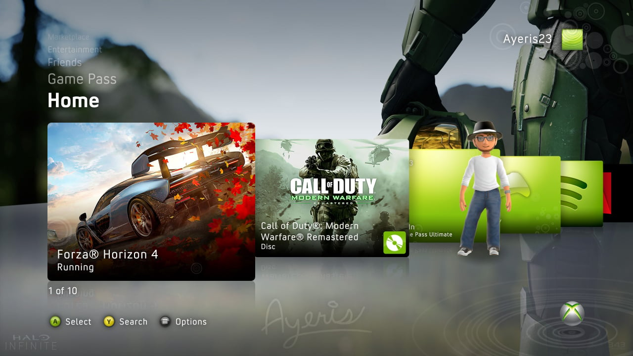
As you can see, it's a modern take on the "New Xbox Experience" dashboard that first debuted in 2008, with this particular design showing off an Xbox Game Pass tab along with a couple of modern games running on the system.
Here's what Ayeris had to say about their design in an exclusive chat with Pure Xbox:
"I always admired the design language of the legacy NXE user interface Microsoft developed in 2008, so much so that I began to grow curious of what it would be like in the modern era. In 2019, I started this project originally to remaster the Xbox 360 NXE dashboard in 4K resolutions or greater. Once I started building assets for the project, it quickly morphed into a hybrid of NXE with a modern twist. This was factoring in customizations with a Halo Infinite background along with custom ordered tiles on the Home tab.
"Taking a closer look, this concept features the modern game suspension feature, allowing Forza to run in the background while you browse the dashboard. You'll notice the tile allows the menu button to be pressed, acting upon that tile similarly to current systems. By contrast, the concept keeps a legacy touch with the disc drive loaded with a copy of Call of Duty: Modern Warfare Remastered, along with the classic profile tile with the charming avatars that have been lost to time."
For those who don't remember, the Xbox 360's 'New Xbox Experience' was eventually followed up by the Metro dashboard in 2011, which ended up being the final UI design on the console. You can't go back to that NXE dashboard (or the iconic 'Blades') if you've since updated to Metro, so it's not very easy to rekindle those precious memories.
The concept we see here from Ayeris is probably never going to become a reality for multiple reasons, but we'd absolutely love it - at least as an alternative to the current Xbox dashboard. Imagine if you could switch between the modern design and all the old Xbox 360 designs including the Blades? So much nostalgia!