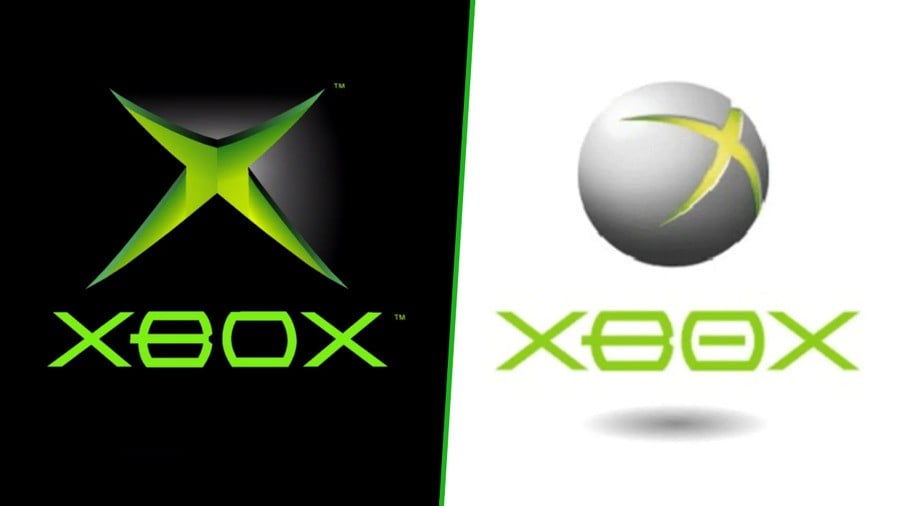
Did you know that Microsoft was considering using (a version of) the Xbox 360 logo for the original Xbox? Thanks to the new Xbox virtual museum, we can see what it would have looked like, and there are various other alternate designs on display as well.
You can see the logo on the right side of the image above, which has the circular Xbox 360 logo design along with the original Xbox font style, although you might notice that the font style is also slightly different than the final version.
Here's a look at the Xbox 360 logo in case it's slipped your mind:
The other two alternate designs provided in the museum are very similar to the one above, but instead show the logo as a cube instead of a sphere. To be honest, we're pretty happy with the final logo choice in the end!
If you haven't yet checked it out, the Xbox virtual museum is absolutely full of details like this, complete with tons of behind the scenes images and audio clips from Xbox team members recounting their memories from 20 years ago.
Definitely check it out!
What do you think of these alternate Xbox logo designs from 20 years ago? Let us know your thoughts below.
[source museum.xbox.com]


Comments 7
I love the low res 360 logo, but the third is cursed!
They made the right choice, the original logo is still the best one.
They should use the cube one on April fools next year. Just come out and say “this is our new logo.” It’d be pretty funny.
Glad they held off on that until they got it down better. The 360 logo is a classic as is the original logo, but those concepts just look bad.
The original green on black is much stronger, though perhaps a little too masculine.
The typography is terrible, especially on the 360 one, not surprised they changed that immediately on the actual 360.
But all in I like the original.
Still love the original logo the most. But they have all been good!
To me, the original black and green one stands out more, it makes a statement, the 360 one is too cheery and happy.
Leave A Comment
Hold on there, you need to login to post a comment...