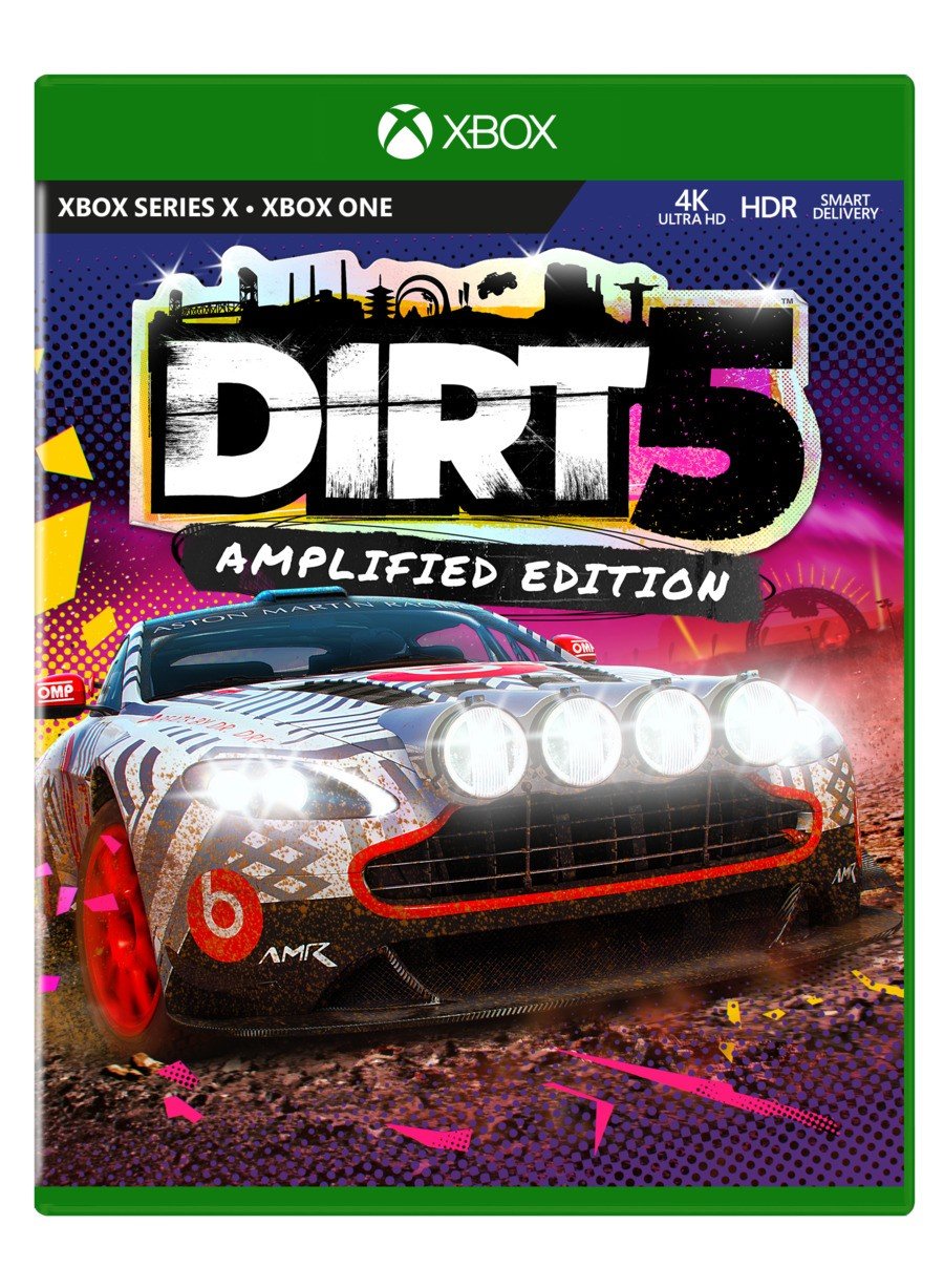
When the first official Xbox Series X box art began to surface last week, you told us that you felt the huge 'Optimised for Xbox Series X' logo on the cover was a bit of an eyesore to put it mildly.
But now, Codemasters has provided a look at the box art for Dirt 5: Amplified Edition with the logo excluded, giving us a much cleaner view of the overall design. You can see this version below:

The question remains - is it a sticker, or is it embedded into the final design? That remains to be seen, as the version over at Amazon does include the logo, along with additional information such as a rating and the Codemasters badge.
Regardless though, we thought we'd have a bit of fun and run another poll to see what you think of the Xbox Series X box art without the logo. Let us know your thoughts in the comments below.
Please note that some external links on this page are affiliate links, which means if you click them and make a purchase we may receive a small percentage of the sale. Please read our FTC Disclosure for more information.
[source twitter.com]


Comments 24
Wait so when r they going to release the Series X optimised version with 120fps?
@Z3u5000 probably quite quickly I would think. I wonder if the optimised for Series X logo will be rethought or not.
I think it looks alot better without that optimized for series x logo on the case..
@Z3u5000 Dirt 5 is optimised for Xbox Series X - this is literally just a look at the cover art without the logo.
I went all digital a few years back so I won’t see this really. Looks cool though
@FraserG I was worried because it didn’t have the 120fps logo.
Without the logo, it’s “ok”.
The thing still has the word “Xbox” 3 times at the top.
Context is odd, though. I feel it should just read “Series X optimized” but then they would want to denote it’s Xbox One compatible somehow, and “One Compatible” is a very weird line.
Maybe it should just be like those 360/One games and have both names on the green line.
@Z3u5000 Ah, OK. I know they've confirmed it will have a 120fps mode, but I don't believe they've shared any concrete details on it recently.
"For Dirt 5, the power of Series X means that the game looks incredible at 60fps – you’ve seen it, it looks fantastic – but we’re also able to offer amazingly smooth, responsive gameplay at 120fps while still looking gorgeous."
This is not the final version because as Fraser said, it doesn't have the rating and publisher badge. Instead of the gigantic rupee, why don't they write "Optimized for Series X * Compatible with Xbox One"?
@BlueOcean they could, but that would be a box wide black bar. I would not mind, personally, but also would just remove the word “Xbox” from the case and just leave the round logo up there.
Side note: I keep insisting all these “series x” branding all over these boxes will become extremely confusing if an “Xbox series s” ends up being introduced later, unless they just call it “Xbox One” or “Series X Lite” or what not....
Maybe just “Series X 1080p Edition”
Or it just adds validity to the “Series S” having no disk drive.
@Tharsman Every time you say remove "Xbox" repetition I wonder "How can you write just "One"? If they remove the word "Xbox" from the case and leave the round logo up there I support your idea and I think that just the logo at the top would look better! I think it's not necessary to write "Xbox One - Xbox Series X", just "Xbox One - Series X" is fine.
Ok, but the game is the XSX version or the XB1 version?
@BlueOcean
>why don't they write "Optimized for Series X * Compatible with Xbox One"?
Agree.
They can just specified that on the black stripe.
But the big rupee is more like a Big Flashy Billboard for XSX marketing purpose. It ruins the cover but game devs barely care for cover art nowadays, sadly...
Isn't having "smart delivery" on the box a bit redundant as well given that it's already listed for Series X and Xbox One?
The whole naming scheme is just a bit too weird.
@roe Thanks. Yes, the gigantic The Legend of Zelda rupee is overkill. I guess parents will realise that the games are optimised though 😂.
@roe Almost everything on these cases is redundant but it wouldn't bother me if all these logos were on the back side.
The rupee better be a sticker. No need for that big thing to be on the front of the box.
This version looks a lot better without it.
Xbox
Xbox Series X - Xbox One, 4K HDR Smart Delivery
Optimised for Series X
Age Rating, Publisher Logo
That's a lot to communicate on top of the game. It should be streamlined. I'd get rid of optimised and perhaps the very top Xbox branding (on the green case).
Featuring Dante optimized for Series X?
@Tharsman
"Maybe it should just be like those 360/One games and have both names on the green line."
Hell, no! 😫 I'd take an even bigger rupee over that obscenity, any day.
@gingataisen You mean this.
https://www.videogamer.com/news/some-xbox-360-games-now-ship-in-xbox-one-boxes
"Xbox One - Xbox 360" "Plays on Xbox One & Xbox 360" 😂.
@BlueOcean
Exactly. It's split personality Xbox! 😫
Just so long as they bring back the colourful spines of the Xbox 360 rather than the boring grey ones from the Xbox One boxes I'll be happy. I like Xbox One cases but those spines look dull as dishwater next to PS4 games on a shelf.
Leave A Comment
Hold on there, you need to login to post a comment...