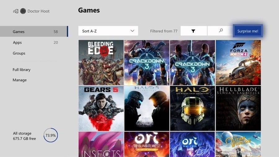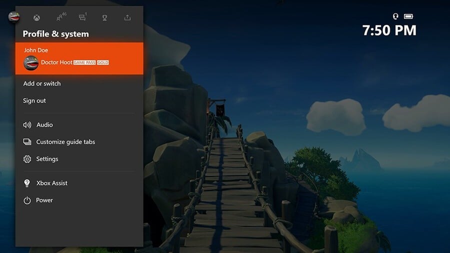
If you're an Xbox Insider (you can sign up via the Xbox Insider Hub on Xbox One), Bradley Rossetti at Xbox has revealed some of the new Xbox features you can expect in April. Among them is a simplified guide layout and the return of the 'Surprise Me!' button for when you can't decide what to play.
Let's start with the simplified guide. Microsoft says that it's experimenting with a "streamlined user interface" with various changes, including combining party, messaging and invites into a new 'parties and chats tab', while settings, audio and power options are now part of the 'profile and system tab'.

Elsewhere, the Storage Management page has been moved into My Games and Apps, and the popular 'Surprise Me' button has returned as mentioned above. You'll find it in the top-right corner of the screen, and you can use it to pick randomly from a selection of filtered games.
Finally, Mixer has also received improvements. The chat system now supports emotes and subscriber badges on Xbox One, while stream settings have also been made easier to access. Additional quality-of-life fixes have been implemented as well.
Not all Xbox Insiders will get access to these new features right away, as Microsoft will only be enabling them for a "portion of the Xbox Insider audience." If you do get selected, however, you should expect to see them arrive sometime later this week, although the new guide has already begun rolling out for some users.
Are you an Xbox Insider? Which of these features sounds most useful to you? Let us know below.
[source news.xbox.com]


Comments 2
This is kind of neat. I've liked seeing how the interface (?) keeps getting more streamlined over time. Although I'm not a huge fan of everything ordered top to bottom instead of left and right like the previous look.
I kind of wish they would fix the messages section, because I've received long txts before where the bottom part was cut off and I've had to use the xbox app on my phone to read the whole thing.
I think that the current UI is pretty good because everything is easily accessible. I moved Pins up on the dashboard. However, the mentioned changes here make sense because it's better to gather communication options and also the typical power and audio options. Also nice to have storage options around the library. The current UI is better than Switch and PS5 in my opinion but at the same time because on Xbox One you have more options and features they still could make things easier to find.
Show Comments
Leave A Comment
Hold on there, you need to login to post a comment...