
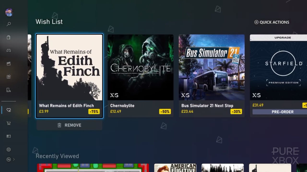
As has been the case in recent Xbox generations, Microsoft has continued to tweak the Xbox Series X|S user interface over the console's life cycle so far - resulting in the current Xbox dashboard we have in the year 2025. The question is, are you happy with the Xbox UI right now?
A new social media post from Xbox super-fan Klobrille has prompted us to talk about this; Klob often posts cool little UI mockups, and has just shared a refreshed version of his recent 'Game Pass UI' concept. We quite like this - it presents the multitude of Xbox Game Pass offerings we get these days quite nicely.
With that being said, would you like Xbox to further tweak its dashboard to look closer to something like this? We must admit that Xbox tends to present its Game Pass stuff quite nicely, but we would like to see some more tweaks to the main dashboard itself. The Xbox home screen still looks quite cluttered in our opinion, and we'd like even more screen real estate saved for those cool-as-heck dynamic backgrounds.
We know the hot topic of ads usually comes up in these sorts of conversations as well, and while we're perhaps not as opinionated on them as some of the Xbox community, we wouldn't say no to those being toned down either. At the end of the day, the Xbox dashboard should be a nice chill space to access and enjoy games at our own leisure!
So, do you have any opinions on what Xbox should change with its console UI? Give us your best ideas in the comments section down below.
Comments 51
No I want it to change on a weekly basis. I hate UI consistency more than Microsoft and Discord does.
I think the store UI is absolutely fine. There could be some improvements (Specifically to how you search for a game-type and how the reviews work) but the home UI could do with an update imo. I would hope that when we get next gen, there's an overhaul to freshen it up.
It's the new blades.
No. But i'm used to it now, and every major revision is worse, so i'd be more worried about what they would introduce like the hundreds of ads for games I don't want to play, movies I don't want to watch and apps I don't want to download on the dashboard. I'd rather it stays as it is, better the devil you know.
It's fine my biggest issue with the OS is not the UI but the inconsistency in the way it runs.
It doesn't seem to have consistent rules to when a button press takes you back one screen or back to the home screen.
It also still does weird things like getting stuck on 'finishing up' games. It just has random little errors and as such feels very 'windows' to use.
Also why doesn't scrolling with the triggers work in the store?
It just feels a bit inconsistent all round to me.
@Kaloudz
I absolutely fine with the GUI now it’s fast and responsive and much improved.
If you use the triggers etc to move about quick it’s even better.
And of course QUICK RESUME is the best console feature this generation.
Would be great without ads.
I prefer the less cluttered PS screen. But the Xbox one works well.
I'm totally fine with it. I like it.
But a question into the round here:
Does someone else besides me have problems with games crashing on Series X???
I have my system for about 2 years and 3 months. In the last 2 months, I had 3 or 4 times that my game suddenly crashed with a black screen and I was returned to home menu.
Some additional Infos.
It wasn't the same game, I had this 1 time with Dragon Age The Veilguard, Lollipop Chainsaw Repop, AC Mirage.
I'm not happy with any of the current-gen console UI, really. All personalization and charm is gone in favor of ads and lifeless blocks and basic themes. Xbox barely edges out the competition with the ability to still use a variety of background images/themes, but even those are a downgrade from 360 days.
I hate it. PS UI has a better layout and much more user friendly than X-Box
I like it better than PS but would ultimately prefer the simplicity of Switch. My biggest gripe is that play time is weirdly buried.
Wish i could hide discord linking, groups/clubs and gamepass. Also have a better way to see friends clips
Year 5 of me asking for the dashboard to have an HDR option so my TV doesn't have a seizure every time I enter and exit a game.
After also playing on a Switch and Playstation, imo, the Xbox UI is the best of all 3. The only thing I don't like is how we have the store both in the main menu and the little tiny menu at the top.
The worst by far is the Playstation. Ugh that thing is so confusing with like 3 different menus all on top of the other that open new menus. Also while we're at it, Xbox also has the best store UI. I hate navigating Switch during their sales, and Playstation again has the worst.
I'm perfectly fine with Xbox UI as is.
Honestly, not even think about the UI when interface with Xbox. So, at least, for me, that just speaks how fine the UI is as it is. Not even think about or notice it.
It’s kind of a moot point now, as we know Xbox Os is in the works to work across multiple devices from Consoles to PC’s and of course handhelds. So it will all change next gen. Some even suggested it’s “light” meaning less bloat and ad’s. So that will be nice.
In it’s current form i still find it the fastest and less clicks then the PS Ui. However the achievements tab is wordy and kind of basic and boring in my opinion. The Ui is old cause it’s windows 8 themed from Xbox one. The store pics and achievement pics need to be 4k, i won’t even get started on all the junk at the bottom of the Ui that was added and is not customizable or able to be deleted. So yes there are many things it would need if it were to be used again but we know Xbox Os is the future and we might even get a look of it sooner than later as Steam Os is looking to expand to handheld PC’s and it’s rumored console.
I don't mind it since I just boot up games.
I don't mind it. It was a little disappointing booting up my Series X for the first time and it looked exactly like my Xbox One.
I think the store page is great.
I’d like my console homepage to start on my library section. And I think having ads randomly pop up is a slippery slope but otherwise it’s pretty good.
@M20B25 the whole launch of the Series X was very barebones. But gladly, the system is much better and more interesting over the years.
It needs background music, like the Wii and Wii U.
Like everything in life It could be a bit better!!🙏
There's a few minor things I'd change (why can you only pin two groups? That's not enough for quick access to Entertainment apps, the backlog, and for some reason Quick Resume somehow counts as a group?!) but aside from that the UI feels remarkably comfy right now.
@OldGamer999 OMG quick resume is outstanding. I love how it works for multiple games simultaneously too. I would also love to know how it works when I turn my Xbox off at the wall and cut complete power 😅 it's like sorcery.
@Ricky-Spanish Like everything in life I could be a bit better!!🙏
Aww dude, there's nothing wrong with you 😜
@HonestHick if you think it will have less ads you are dreaming.
@Kaloudz Haha 🤣 thanks dude to be honest I misspelled meant to say it instead of I but your vote of confidence is very much appreciated haha 😂🙆
I want something like the Switch: totally lightweight so all the consoles resources are dedicated to games.
Make a version of Windows that’s the same! No fluff - just games (though I guess a little fluff would be necessary for access to various storefronts).
Just give me the ability to fully customise my home screen instead of having it filled with stuff I don't want to see. At one point we were able to add multiple groups to it and pretty much organise it how we liked but they've since removed much of that and made it much worse
@Ricky-Spanish I thought it was a typo 🤣 couldn't let that one go though haha.
@Kaloudz
It is a simple memory for each game in quick resume to the hard drive. Just some data, but clever.
I don't mind it but when the snap feature was a thing, I do miss that Ui. The Ui at the time was more technical and a little more in-depth, it was buggy and slow but that was the Xbox one era I suppose.
@Kaloudz I said exactly that to someone yesterday. I took my Xbox to my brother's and was like "I've no idea how this quick resume works when I've unplugged the console and brought it here". Definitely magic and I don't want anyone trying to explain it otherwise.
Still need more than two groups on the homepage. It’s still two more than PS5 and Switch though. All the platform holders want us to forget about any games we didn’t launch recently so we’ll buy new ones.
@PsBoxSwitchOwner i didn’t say i thought it would have no ad’s but there have been some talk of a light Ui for Xbox os. But i would suspect it will have at least GP ad’s. Which i mean make sense if Xbox os will be on things like non MS handhelds and other devices.
Just let me play my games and access my library as the absolutely first thing I see that takes up the first screen. I don't want to see ads everywhere. They could make a News section and keep all the ads there rather than have their rotating ads on the home page. For those of you without GPU, I also hate how it literally prompts you to buy GPU at every possible opportunity and interaction on the Xbox. Like please, let us tick a box to not be reminded.
The UI needs an update. It's clunky and doesn't emphasize the GAMES
@GamingFan4Lyf I'd love this too!
I quite like the Xbox UI it's easy to navigate and see everything I need at a glance. I personally have gamepass added to my home screen that shows me all the recently released gamepass titles. This makes it nice for me to see what's been added at glance.
The one thing I'd like to see is the ability to put everything out of sight so we can see our awesome custom backgrounds. Like if we can hit a button like down on D pad to hide everything and when we want it to go back to normal we just press up on D pad and everything is as it was. Overall though I'd give the Xbox UI a solid 4/5
Store is great generally, Search is super fast, "desktop" main place of interaction well, it sucks. It's different than PS and Nintendo just worse.
@OldGamer999 Ah right. See, I'd always put it down to Gandalf or Dumbledore running around in my Series S lol! I certainly hope it's a feature that's never bucked.
@LaurenceJ1987 Haha!! For me, I was playing a game and had a three hour power-cut. Spent those three hours gutted that I never saved my game. When power came back on, quick resume kicked in and like you, was convinced it was magic ever since lol!
It’s okay. I definitely prefer the current dashboard main screen to the original one - just a shame we lost ability to customise when you scroll down, but I’ve trained muscle memory to mostly no longer do that anymore.
My main criticisms:
1) Adverts on main screen. Though they show restraint by keeping them gaming related most of the time, I’m still suffering PTSD from being exposed to that fast food advert - will forever be scarred by that disgusting abomination. Not cool Microsoft.
2) Performance is inconsistent. Often times it’s absolutely fine but sometimes it’s more laggy and unresponsive than the literally decade old mobile hardware inside the Nintendo Switch. What’s up with that? And these performance issues just pop up randomly.
3) Dynamic wallpapers are under-utilised. A dire lack of game-neutral abstract backgrounds, they haven’t added any new ones in literally years. As for the game-specific backgrounds, they mostly just focus on live service games and annualised franchises, boring!
4) Store, community, and profile personalisation features - compared to Switch they’re light years ahead, but compared to Steam they’re light years behind. Can’t really elaborate because I’ll be here all day, but Valve undisputedly sets the gold standard for all of these things.
@Cakefish Not sure if you've known but the second and third tiles in the second row have always had the menu button options for more/less like this. Well today I just discovered that the fourth tile, which was always just an advert, now has the menu button options.
Prefer the PS5 dashboard if I'm honest. Feels more modern, looks better. Only downside to PS5 is finding the right version of the game you want...
@Kaloudz Yeah Why don't MS Bang on about it more, it's a GREAT Feature!!
Far better than PSN
No, I want the UI to be more community freindly like steam. I want to have better comment section in games' page, five-star reviews, upvotes/downvote on comments. I want better exploration and more filters when I search for games. A steam-like UI will be the optimal UI for XBOX app.
@Phil-Spencer-Gate I agree they could learn so much from Steam, Valve are so far ahead in so many ways.
Lacks customisation, sucks to navigate at all. A lot of internet sucking garbage on the top level and underneath. A terrible storefront that's worse then it was before. I liked it isolated now the button is a pain to close this is back to Windows 8 task manager to close them but with the app active and closing it so the updates function on the Xbox.
It's the worst console UI or OS in general I've ever seen. Microsoft made the most pathetic piece of garbage I've ever seen/wanted to avoid using.
Prefer Blades/Metro of 360 and 2013 and maybe 3rd of Xbox One and 3rd Series X one (I assume were in the 4th of Xbox Series now right?). That's it. the rest are terrible to look at and navigate to anything.
I keep an Xbox One VCR/OG offline to avoid it even. Sure it won't get the later Xbox One games but I don't care. I wouldn't do it for a Blades 360 either as games over UI even if I prefer Blades or the Metro of 360 Dashboards over any Xbox One dashboard besides the 2013 one that the 2017 era cut the features of.
But wow may to offer customisation, cut it and make it even worse.
The back end settings is the same and still confusing why they haven't changed it is beyond me I hate it.
The Xbox One X runs like garbage on launch then balances out. Why? I hate internet web pages that are too fancy and garbage to load. It's by design and I hate it. Stop pushing performance that doesn't need to be pushed. I'm not upgrading because of your bad designs by designers/artists and bad programming skills of all your staff.
When Fruteger Aero of Windows Vista./7 and more particular design of futuristic or common objects of iPhones of old looks more intense yet was better to run on devices then the flat but performance hogging garbage of nowadays because of terrible backends with spyware and trash it proves a point. XD Simple and flat sure but runs like garbage for how minimal it is that it shouldn't have issues, I don't think that's acceptable at all.
0/1000
Like the UI just fine. Wish they would add HDR to it.
I am probably in the minority that I quite like it in comparison with the prior version. I specially like the shortcuts on top. But to be frank, since the update, I pretty much never scroll down as there is nothing there for me lol (but I just don't care 😅)
The prior dashboard jsed to let ypu put as many Groups as you wanted in a vertical stack on the Home page. It was perfect for organizing your games especially if you had a bunch and it looked quite sleek to scroll down. Now you can only put two before they get hidden away in favor of showing you more Game Pass advertising. It drives me nuts how all 3 consoles are taking away so much customization.
Leave A Comment
Hold on there, you need to login to post a comment...