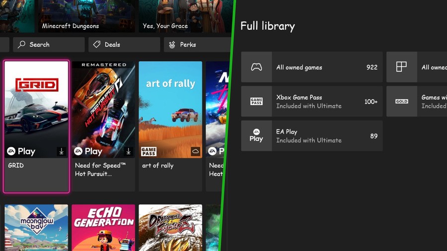
Comic Sans is an abomination of a font - we won't hear otherwise (editor's note: actually I don't think it's that bad!). It's often joked as being an awful eyesore and as a result, it's rarely used in a formal sense. However, after being challenged to transform the Xbox dashboard into a striking font, a few Xbox software engineers have risen to the occasion.
It all began when the topic of Comic Sans and its potential use on Xbox arose on Twitter, in which Xbox engineer DeekyJay shared a horrifying concept of it in action.
It didn't stop there, however, as Xbox's lead engineer Eden Marie also got in on the fun and went one step further. Various pages, including the store and profile, were all altered to support Comic Sans font.
Yuck!
While some users would perhaps like this font ironically, we're hoping it doesn't make its way to a console near us. It would actually be quite cool to have the ability to adjust the font, but this isn't it.
Still, we imagine in a parallel universe, Comic Sans is the hot font to go for, and maybe, just maybe, it's supported on games consoles.
Would you like to see Comic Sans font on Xbox? Drop us a comment and let us know.
[source twitter.com, via twitter.com]


Comments 14
Haha, I like this stuff.
MS show a friendly and fun side quite often, I am aware that it's not to everyone's taste....but there are miserable people everywhere.
Comic Sans is hideous though. Haha
Strangely it's a pretty decent font for some people with dyslexia.
I wanna change my font here
I kinda wonder what 4/1 is going to be like now …
Removed - inappropriate
That's it, PS5 all the way. Take my $70 Uncle Jimmy. TAKE IT!!
Nothing says a great sense of humour more than a font based joke.
We are all laughing.
I get people don't like the font, but it is really helpful for those with dyslexia and is largely used in the education system for that reason and stuff like this really comes off as ableist and lazy.
Every time Eden Marie is in a post it’s good natured humour or a heart warming story. (Previously updating old gamer profile pics or 360 blades)
Always nice to see someone enjoying their job.
@LaserdiscGal she mentioned in a follow up tweet that while it had been a joke initially they had taken on board the dyslexia points and were looking into it as a team
https://twitter.com/neonepiphany/status/1453426732917145606?s=20
🕈︎♓︎■︎♑︎♎︎♓︎■︎♑︎⬧︎ ♓︎⬧︎ ⧫︎♒︎♏︎ ♐︎□︎■︎⧫︎ ✋︎ ⬥︎□︎◆︎●︎♎︎ ◆︎⬧︎♏︎ ♋︎⬧︎ ⬥︎♏︎●︎●︎📬︎ 👌︎♏︎⬧︎⧫︎ ♐︎□︎■︎⧫︎ ♏︎❖︎♏︎❒︎📬︎
What, can't read it?
It's not awful, it's just a comic font for comics and fun.
Interesting about the dyslexia thing, never knew that, but that's a coincidence, it's not like the font was originally designed as an accessibility tool, it was just a designer font that was intended to look like hand written text in classic comic book speech bubbles. Then people overused it on otherwise serious or formal content and it became a running meme of inappropriate font use (a frivolous, whimsical comic font used in company pages, instruction manuals, appliance labeling, etc.)
Surely there must be accessibility fonts designed for dyslexia that don't make things look like children's books?
Nothing will top the usage of Comic Sans in the Silent Hill Collection; like, what were they thinking?
Show Comments
Leave A Comment
Hold on there, you need to login to post a comment...