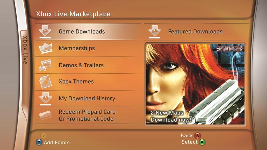
If you hadn't already heard - Xbox's 20th-anniversary website is currently rocking the classic Xbox 360 blades design.
Sure enough, it's got fans talking about the possible return of the blades as a theme on Xbox Series X|S. If you were wondering if it's going to happen, it seems the question has already been asked.
From one Xbox employee to another, in fact.
Here's the funny exchange between Xbox engineering lead, Eden Marie, and Xbox software engineer, Brenna Duffitt:
In a follow-up tweet, Marie acknowledged it as a "spicy" joke tweet, but still admitted loving the blades theme. Whether this will lead to something though, sounds unlikely. In saying this, Marie was the one who led the charge for the return of Xbox 360 gamerpics.
Would you like to see Xbox add a blades theme to Xbox Series X|S in time for the 20th anniversary? Comment below.


Comments 10
Don't have a series console I'd like to see it added on my Xbox one though
The blades were the best
I would be so upset if they made the blades for my series X. I hated that design and thought it was ugly as hell.
Never understood the love for the blades myself. The current UI might lack personality but it makes up for it in functionality and reliability across many devices.
The blades dash is all about nostalgia. I'm not sure it would work well with all the features of the modern console.
That said I liked it at the time, but was excited every time they changed the 360 dash over the years, it was like getting a new console.
How about an animated blades background instead?
Was never a big fan of this UI or its aesthetic.
I miss the blades. The xbox UI has never clicked with me since.
A consistent UI across generations is something people actually appreciate. The clean UI of the psp, ps3, ps4 and ps5 are familiar and tinged with nostalgia. They didn't change mid generation and they all evoke a Playstation aesthetic.
I miss the blades. I actually had a theme on my PS3 that was the Xbox 360 blades. It was glorious.
The Blades were the best theme ever, PERIOD. People who don't like them miss the point of the reasons why. It's not just about the aesthetic.
Of course, if the initial impression is bad, and personal taste is obviously always a thing, then it might be a turn off at first glance, but the Blades theme was clean, simple, fast and effective/efficient, things that most definitely can NOT be said about any of the newer themes, ever since Microsoft decided to go all "Windows 8 tiles style" on the Xbox 360 and Xbox One.
And to this day, it's still a muddled clutter, with options that should be readily available hidden everywhere behind sub-menus and what not, and even making things customizable isn't always the best solution.
Far as I'm concerned, the Blades should come back, and to not bother any of those that are opposed to the idea, they could simply add it as an additional and/or downloadable theme. Shouldn't be too hard to do and I'd easily dare to wager a bet that it would be popular as hell.
Show Comments
Leave A Comment
Hold on there, you need to login to post a comment...